I’m not a climatologist. But, if I would have to pick just one field where data visualizations can make the biggest difference, it’s probably in climatology. While graphs showing changes in sea ice, surface temperature etc are ubiquitous, I have had a wish to peak at the underlying data and produce such graphs myself, and possibly find novel ways to tell stories with the data. Besides, it’s a lot of fun!
Arctic sea ice
Some reusable elements for the ggplots:
Show the code
library(showtext)library(tidyverse)library(RColorBrewer)"%ni%"<-Negate("%in%")comma_delim <-locale(decimal_mark =",")font <-"Roboto"theme_dark <-function() {theme(plot.title =element_text(family = font, size =24, lineheight =0.3, color ="#e0e0e0", face ="bold"),plot.subtitle =element_text(family = font, size =14, lineheight =1.1, color ="#CCCCCC", face ="italic"),plot.caption =element_text(family = font, size =12, color ="#888888"),axis.title.x =element_blank(),axis.title.y =element_text(size =14, color ="#888888", family = font),axis.text.y =element_text(size =13, color ="#888888", family = font),axis.text.x =element_text(size =13, color ="#888888", family = font),panel.grid.major.y =element_line(color ="#444444", size =0.1),panel.grid.major.x =element_line(color ="#333333", size =0.1),panel.grid.minor =element_blank(),axis.ticks.y =element_blank(),axis.ticks.x =element_line(color ="#333333", size =0.1),panel.background =element_rect(color =NA, fill ="#222222"),plot.background =element_rect(color =NA, fill ="#222222"),legend.title =element_blank(),legend.text =element_text(family = font, size =10, color ="#F9F9F9"),legend.background =element_rect(fill =NA, color =NA),legend.key.height =unit(1, "mm"),plot.margin =unit(c(6, 4, 6, 4), "mm") )}theme_light <-function() {theme(plot.title =element_text(family = font, size =24, lineheight =0.3, color ="#222222", face ="bold"),plot.subtitle =element_text(family = font, size =14, lineheight =1.1, color ="#222222", face ="italic"),plot.caption =element_text(family = font, size =12, color ="#888888"),axis.title.x =element_blank(),axis.title.y =element_text(size =14, color ="#888888", family = font),axis.text.y =element_text(size =13, color ="#888888", family = font),axis.text.x =element_text(size =13, color ="#888888", family = font),panel.grid.major.y =element_line(color ="#d0d0d0", size =0.1),panel.grid.major.x =element_line(color ="#d0d0d0", size =0.1),panel.grid.minor =element_blank(),axis.ticks.y =element_blank(),axis.ticks.x =element_line(color ="#888888", size =0.1),panel.background =element_rect(color =NA, fill ="#FFFFFF"),plot.background =element_rect(color =NA, fill ="#FFFFFF"),legend.title =element_blank(),legend.text =element_text(family = font, size =10, color ="#888888"),legend.background =element_rect(fill =NA, color =NA),legend.key.height =unit(1, "mm"),plot.margin =unit(c(6, 4, 6, 4), "mm") )}
Daily NOAA Arctic sea ice data
April means (1978 - present)
Show the code
# We can get an overview of the folder structure in the ftp server using the threadr package (not available on CRAN)# remotes::install_github("skgrange/threadr")library(threadr)library(ggpubr)library(ggbeeswarm)contents <- threadr::list_files_ftp("ftp://sidads.colorado.edu/DATASETS/NOAA/G02135")# We identify the path to the daily data sea ice extent csv for north (i.e. Arctic)url <-"ftp://sidads.colorado.edu/DATASETS/NOAA/G02135/north/daily/data/N_seaice_extent_daily_v3.0.csv"# We can download the file to a directory in the project folderdownload_ftp_file(url, "ice/noaa_download/noaa_data.csv", verbose =TRUE)noaa_arctic <-read_csv("ice/noaa_download/noaa_data.csv")# The raw data has a top row that we do not neednoaa_arctic <- noaa_arctic[-1, ] %>%mutate_at(vars(Year, Month, Day, Extent), as.numeric) %>%mutate(date =dmy(paste0(Day, "-", Month, "-", Year))) %>%select(-c(Year, Month, Day)) %>%mutate(yr =year(date),mo =month(date) ) %>%# Create a 'day' variablegroup_by(yr) %>%mutate(day =as.numeric(date -floor_date(date, "year")) +1)noaa_arctic_apr_means <- noaa_arctic %>%# Filter only April'sfilter(mo ==04) %>%# We skip the final year since it does not necessarily have data for Aprilfilter(yr <max(noaa_arctic$yr)) %>%group_by(yr) %>%summarise(mean_extent =mean(Extent),sd_extent =sd(Extent))lm_fit <-lm(mean_extent ~ yr, data = noaa_arctic_apr_means)slope <-round(lm_fit$coefficients[[2]], 3)lower <-round(confint(lm_fit)[[2, 2]], 3)upper <-round(confint(lm_fit)[[2, 1]], 3)pval <-formatC(summary(lm_fit)$coefficients[[2, 4]], 2)lm_res <-paste0("Estimated change per year (million square km):\n", slope,", 95% CI [", lower, " to ", upper, "], p = ", pval)arrow <-arrow(type ="closed", length =unit(1.8, "mm"))noaa_arctic_apr_means_p <-noaa_arctic_apr_means %>%ggplot(aes(x = yr, y = mean_extent)) +geom_ribbon(aes(ymin = mean_extent - sd_extent, ymax = mean_extent + sd_extent), fill ="#c1cacf")+geom_line(color ="#798d94", size =1) +labs(title =paste0("NOAA Arctic Sea Ice - 1979-", max(noaa_arctic_apr_means$yr)),subtitle ="April sea ice extent, in million square km" ) +theme_light()+theme(axis.line.x =element_line(color ="#d0d0d0", size =0.2),axis.ticks.x =element_line(color ="#d0d0d0", size =0.2),axis.ticks.length=unit(.25, "cm"),plot.title =element_text(margin =margin(l =-30, b =8), color ="#798d94"),plot.margin =unit(c(2, 8, 2, 2), "mm"),plot.subtitle =element_text(margin =margin(l =-33, b =8), color ="#888888"),panel.grid.major.x =element_blank(),axis.title.y =element_blank())+scale_x_continuous(expand =c(0,0), breaks =c(1979, 1990, 2000, 2010, 2020, 2024))+scale_y_continuous(breaks =seq(13.5, 16, 0.5), expand =c(0,0), limits =c(13, 16))+# Annotationsgeom_text(label = lm_res, color ="#798d94", size =4, family = font, x =2019.8, y =15.9, hjust =1, vjust =1)+annotate(geom ="text", label ="Yearly average", family = font, color ="#798d94", size =4, x =2000, y =13.6, hjust =1)+geom_curve(aes(x =2000.2, xend =2004, y =13.6, yend = noaa_arctic_apr_means %>%filter(yr ==2004) %>%pull(mean_extent)), linetype ="solid", size =0.15, color ="#999999", arrow = arrow, curvature =0.3) +annotate(geom ="text", label ="Yearly standard deviation", family = font, color ="#798d94", size =4, x =2000, y =13.35, hjust =1) +geom_curve(aes(x =2000.2, xend =2004, y =13.35, yend = noaa_arctic_apr_means %>%filter(yr ==2004) %>%mutate(y_pos = mean_extent - sd_extent) %>%pull(y_pos)), linetype ="solid", size =0.15, color ="#999999", arrow = arrow, curvature =0.1)# We can also look at the decadal distributionsnoaa_arctic_decadal <- noaa_arctic_apr_means %>%mutate(decade =case_when(yr >=1980& yr <1990~"1980's", yr >=1990& yr <2000~"1990's", yr >=2000& yr <2010~"2000's", yr >=2010& yr <2020~"2010's", yr >=2020~"2020's")) %>%filter(!is.na(decade)) %>%ggplot(aes(x = decade, y = mean_extent))+stat_boxplot(geom ="errorbar", width =0.2, size=0.2, position =position_dodge(0.5), color="#798d94") +geom_boxplot(width =0.5, outlier.color ="#E0E0E0", outlier.stroke =0.1, outlier.size =0.8, outlier.shape =21, color ="#798d94", size=0.4) +geom_quasirandom(shape =21, fill ="#798d94", color ="#F0F0F0", stroke =0.15, width =0.2, size =2)+stat_summary(fun.y = median, fun.ymin = median, fun.ymax = median, geom ="crossbar", width =0.5, color ="#798d94", size =0.25, position ="identity")+theme_light()+theme(axis.line.x =element_line(color ="#d0d0d0", size =0.2),axis.ticks.x =element_line(color ="#d0d0d0", size =0.2),axis.ticks.length=unit(.25, "cm"),panel.grid.major.x =element_blank(),plot.subtitle =element_text(color ="#888888"),axis.title.y =element_blank(),axis.text.x =element_text(angle =45, hjust =1, vjust =1),axis.text.y =element_text(hjust =0) )+labs(subtitle ="Decadal distributions" )+scale_y_continuous(breaks =seq(13.5, 16, 0.5), expand =c(0,0), limits =c(13, 16), position ="right")library(patchwork)p <- noaa_arctic_apr_means_p + noaa_arctic_decadal +plot_layout(nrow =1, widths =c(3, 1.3)) +plot_annotation(caption ="Source: Sea Ice Index, Version 3, data set ID G02135. Accessed from: ftp://sidads.colorado.edu/DATASETS/NOAA/G02135" ) &theme(plot.caption =element_text(family = font, size =7, color ="#CCCCCC"))p
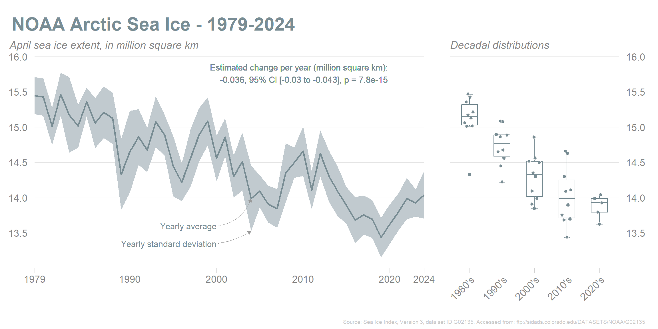
Arctic sea ice extent for April, 1978 to present (2024).
All months, grouped by year
Show the code
# One line per year# ----------------->cols <-c(rep(rev(brewer.pal(11, "RdYlBu"))[[1]], 2), # 1978 to end of 1979rep(rev(brewer.pal(11, "RdYlBu"))[[3]], 10), # 1980 to end of 1989rep(rev(brewer.pal(11, "RdYlBu"))[[5]], 10), # 1990 to end of 1999rep(rev(brewer.pal(11, "RdYlBu"))[[7]], 10), # 2000 to end of 2009rep(rev(brewer.pal(11, "RdYlBu"))[[9]], 10), # 2010 to end of 2019rep(rev(brewer.pal(11, "RdYlBu"))[[10]], 4), # 2020 to 2023rep(rev(brewer.pal(11, "RdYlBu"))[[11]], 2) # 2024, 2025)# Compute 7-day rolling avglibrary(zoo)zoo_data <-zoo(noaa_arctic$Extent, order.by = noaa_arctic$date)moving_avg <-rollapply(zoo_data, width =7, FUN = mean, align ="right", fill =NA)noaa_arctic$roll <-as.vector(moving_avg[noaa_arctic$date])# We can investigate the earliest and latest dates (for each year) where the minimum extent was reached for that year. We use the rolling values for this, although it would perhaps be more appropriate to use the actual extents. But since we show rolling means for the lines, we keep it simple.min_max <- noaa_arctic %>%filter(yr %ni%c(1978, 2025)) %>%# We do not consider incomplete years since they may not have had their actual minimums recordedmutate(yr =as.factor(yr)) %>%group_by(yr) %>%filter(roll ==min(roll)) %>%ungroup() %>%summarise(min_day =min(day),max_day =max(day) )ice_year <- noaa_arctic %>%mutate(yr =as.factor(yr)) %>%ggplot(aes(x = day, y = roll, color = yr)) +geom_line(aes(group = yr)) +theme_dark()+theme(legend.position ="none",axis.title.y =element_blank(),plot.title =element_text(margin =margin(l =-20, b =8)),plot.subtitle =element_text(margin =margin(l =-20, b =4)) )+scale_color_manual(values = cols) +scale_y_continuous(breaks =seq(4, 16, 2)) +scale_x_continuous(breaks =c(1, 32, 60, 91, 121, 152, 182, 213, 244, 274, 305, 335), labels =c("Jan 01", "Feb 01", "Mar 01", "Apr 01", "May 01", "Jun 01", "Jul 01", "Aug 01", "Sep 01", "Oct 01", "Nov 01", "Dec 01"), expand =c(0, 0), limits =c(1, 365)) +geom_point(data = noaa_arctic %>%filter(yr ==2024& day ==max(day)), aes(x = day, y = roll), size =3, color =rev(brewer.pal(11, "RdYlBu"))[[11]], fill ="#222222", shape =21) +labs(title ="NOAA Arctic sea ice extent",subtitle ="Arctic sea ice extent, million square km.",caption ="Source: ftp://sidads.colorado.edu/DATASETS/NOAA/G02135" ) +# Indicate the place where the ice extent minimums occurred (this is approximately where the data for the ice_min plot is from)geom_rect(aes(xmin = min_max$min_day, xmax = min_max$max_day, ymin =3, ymax =8), color ="#F0F0F0", fill =NA, size =0.4, linetype ="dashed")# Focus on melting seasonlibrary(geomtextpath)library(ggrepel)library(ggpubr)# A plot which indicates when the (rolling) minimums appearice_min_2 <- noaa_arctic %>%mutate(yr =as.factor(yr)) %>%filter(day >= min_max$min_day -1& day <= min_max$max_day +1) %>%ggplot(aes(x = day, y = roll, color = yr, size = roll)) +geom_line(size =0.2) +geom_point(data = noaa_arctic %>%filter(yr %ni%c(1978, 2025)) %>%mutate(yr =as.factor(yr)) %>%group_by(yr) %>%filter(roll ==min(roll)),aes(x = day, y = roll) ) +geom_text_repel(data = noaa_arctic %>%filter(yr %ni%c(1978, 2025)) %>%mutate(yr =as.factor(yr)) %>%group_by(yr) %>%filter(roll ==min(roll)),aes(x = day, y = roll, label = yr),size =3, family = font, box.padding =0.3 ) +scale_color_manual(values = cols) +theme_void() +theme(panel.background =element_rect(color =NA, fill ="#222222"),plot.background =element_rect(color =NA, fill ="#222222"),plot.margin =unit(c(0, 5, 0, 2), "mm"),plot.title =element_text(family = font, size =14, lineheight =0.3, color ="#e0e0e0", face ="bold"),plot.subtitle =element_text(family = font, size =12, lineheight =1.1, color ="#CCCCCC", face ="italic"),legend.position ="none",plot.caption =element_text(size =10, color ="#666666") ) +scale_size(range =c(0.8, 3)) +scale_y_discrete(expand =c(0.05, 0.05)) +geom_rect(aes(xmin =-Inf, xmax =Inf, ymin =-Inf, ymax =Inf), fill =NA, color ="#F0F0F0", linetype ="dashed", size =0.4) +labs(title ="Yearly ice minimums")arctic_ice_group_by_yr <-ggarrange(ice_year, ice_min_2, nrow =1, widths =c(4, 1), align ="h")arctic_ice_group_by_yr
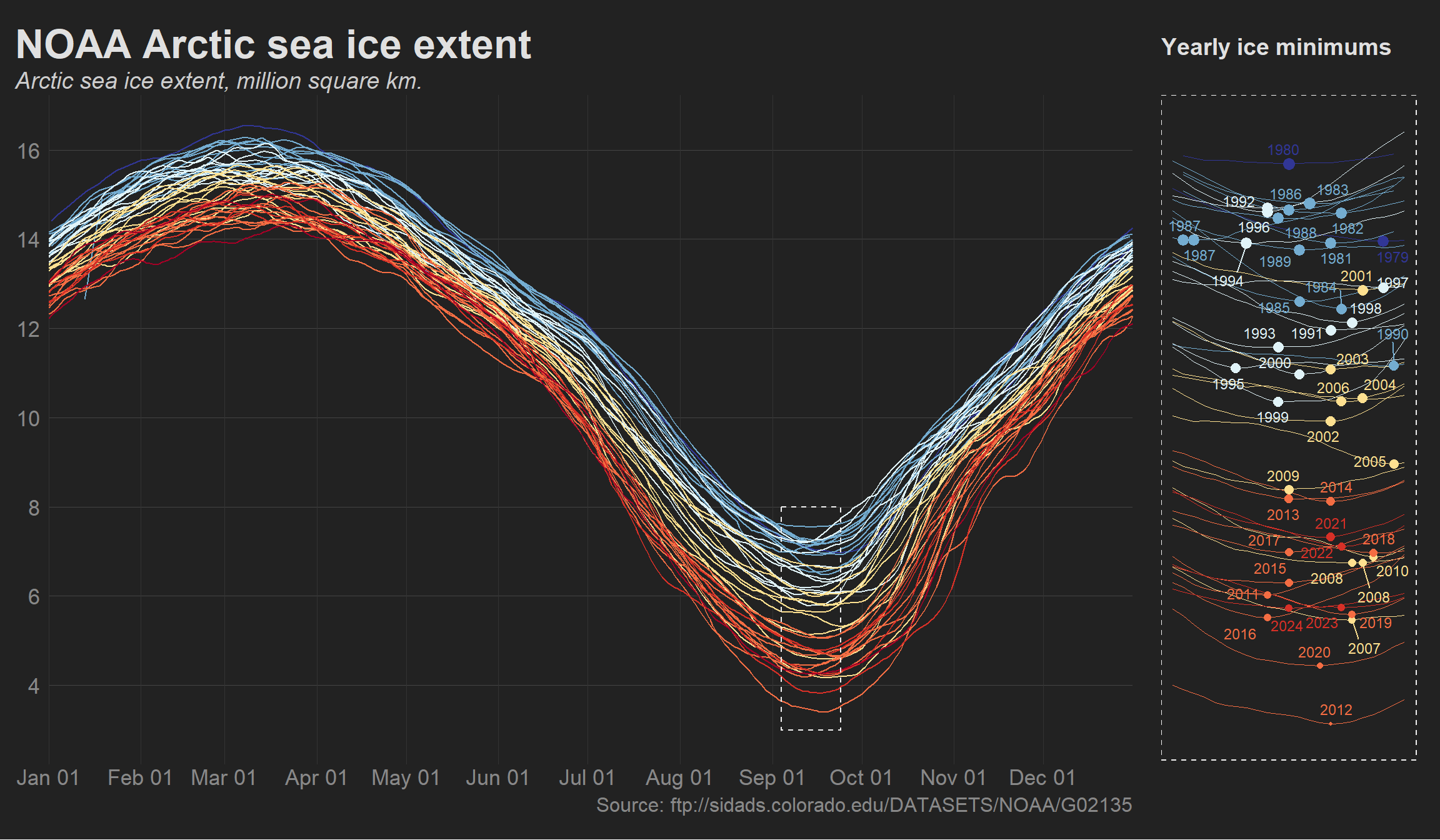
Arctic sea ice extent year-by-year. The right-hand panel shows each year, ordered descendingly by yearly minimum.
Year 2024 compared to the mean of 1981-2010
Show the code
library(ggplotify)mean_sd_data <- noaa_arctic %>%filter(yr >=1981& yr <=2010) %>%group_by(day) %>%summarise(mean_extent =mean(Extent),sd_extent =sd(Extent) )# Interpolate the SDs to get smoother ribbonsinterpolated_sd <-smooth.spline(mean_sd_data$day, mean_sd_data$sd_extent, spar =0.2)# Legendleg <-data.frame(y =c(7:1),x =c(rep(1, 7)),fill =c(0, 1, 2, 3, 0, 0, 0),lab =c("Mean 1981-2010","+/- 1 SD","+/- 2 SD","2012","2020","2024","2025" ) ) %>%mutate(fill =as.factor(fill)) %>%ggplot() +geom_tile(aes(x = x, y = y, fill = fill), color ="white", size =2) +theme_void() +theme(legend.position ="none") +# Mean 1981-2010geom_segment(aes(x =0.5, xend =1.5, y =7, yend =7), color ="#444444", linetype ="dashed", size =0.8) +# 2012geom_segment(aes(x =0.5, xend =1.5, y =4, yend =4), color ="#444444", linetype ="solid", size =0.2) +# 2020geom_segment(aes(x =0.5, xend =1.5, y =3, yend =3), color ="#bd5099", linetype ="solid", size =0.2) +# 2024geom_segment(aes(x =0.5, xend =1.5, y =2, yend =2), color ="#bd3131", linetype ="solid", size =0.5) +# 2025geom_segment(aes(x =0.5, xend =1, y =1, yend =1), color ="#bd3131", linetype ="solid", size =0.8) +geom_point(aes(x =1, y =1), shape =16, stroke =1, color ="#bd3131", size =4) +geom_text(aes(x =1.6, y = y, label = lab), hjust =0, family = font, size =4.5, color ="#444444") +scale_fill_manual(values =c("white", "#9ecae1", "#deebf7", "white")) +scale_x_continuous(limits =c(0.5, 5))# Plot the data with smoothed model fit with SD and 2xSD intervalsice_rel_1981_2010 <-ggplot(mean_sd_data, aes(x = day, y = mean_extent)) +geom_line() +# Add a line plot of mean extentgeom_ribbon(aes(ymin = mean_extent -2*predict(interpolated_sd, mean_sd_data$day)$y,ymax = mean_extent +2*predict(interpolated_sd, mean_sd_data$day)$y ),fill ="#deebf7", alpha =0.7 ) +# Add smoother ribbon for 2*SD intervalgeom_ribbon(aes(ymin = mean_extent -1*predict(interpolated_sd, mean_sd_data$day)$y,ymax = mean_extent +1*predict(interpolated_sd, mean_sd_data$day)$y ),fill ="#9ecae1", alpha =0.7 ) +geom_smooth(method ="loess", se =FALSE, color ="#222222", span =0.1, linetype ="dashed") +# 2012geom_line(data = noaa_arctic %>%filter(yr ==2012),aes(x = day, y = roll), size =0.2, color ="#444444" ) +# 2020geom_line(data = noaa_arctic %>%filter(yr ==2020),aes(x = day, y = roll), size =0.2, color ="#bd5099" ) +# 2024geom_line(data = noaa_arctic %>%filter(yr ==2024),aes(x = day, y = roll), size =0.6, color ="#bd3131" ) +# 2025geom_line(data = noaa_arctic %>%filter(yr ==2025),aes(x = day, y = roll), size =1, color ="#bd3131" ) +labs(y ="",title ="NOAA Arctic sea ice extent",subtitle ="Arctic sea ice extent (million square kilometers)",caption ="Source: ftp://sidads.colorado.edu/DATASETS/NOAA/G02135" ) +theme_minimal(base_family ="Montserrat",base_size =14 ) +theme(axis.title.x =element_blank(),axis.title.y =element_blank(),plot.caption =element_text(size =10, color ="#999999"),panel.grid.minor =element_blank() ) +scale_x_continuous(breaks =c(1, 32, 60, 91, 121, 152, 182, 213, 244, 274, 305, 335), labels =c("Jan 01", "Feb 01", "Mar 01", "Apr 01", "May 01", "Jun 01", "Jul 01", "Aug 01", "Sep 01", "Oct 01", "Nov 01", "Dec 01"), expand =c(0, 0), limits =c(1, 365)) +scale_y_continuous(breaks =seq(4, 16, 2)) +geom_point(data = noaa_arctic %>%filter(yr ==2025& day ==max(day)),aes(x = day, y = roll), shape =16, size =4, color ="#bd3131" ) +annotation_custom(grob =as.grob(leg), xmin =10, xmax =90, ymin =4, ymax =8)ice_rel_1981_2010
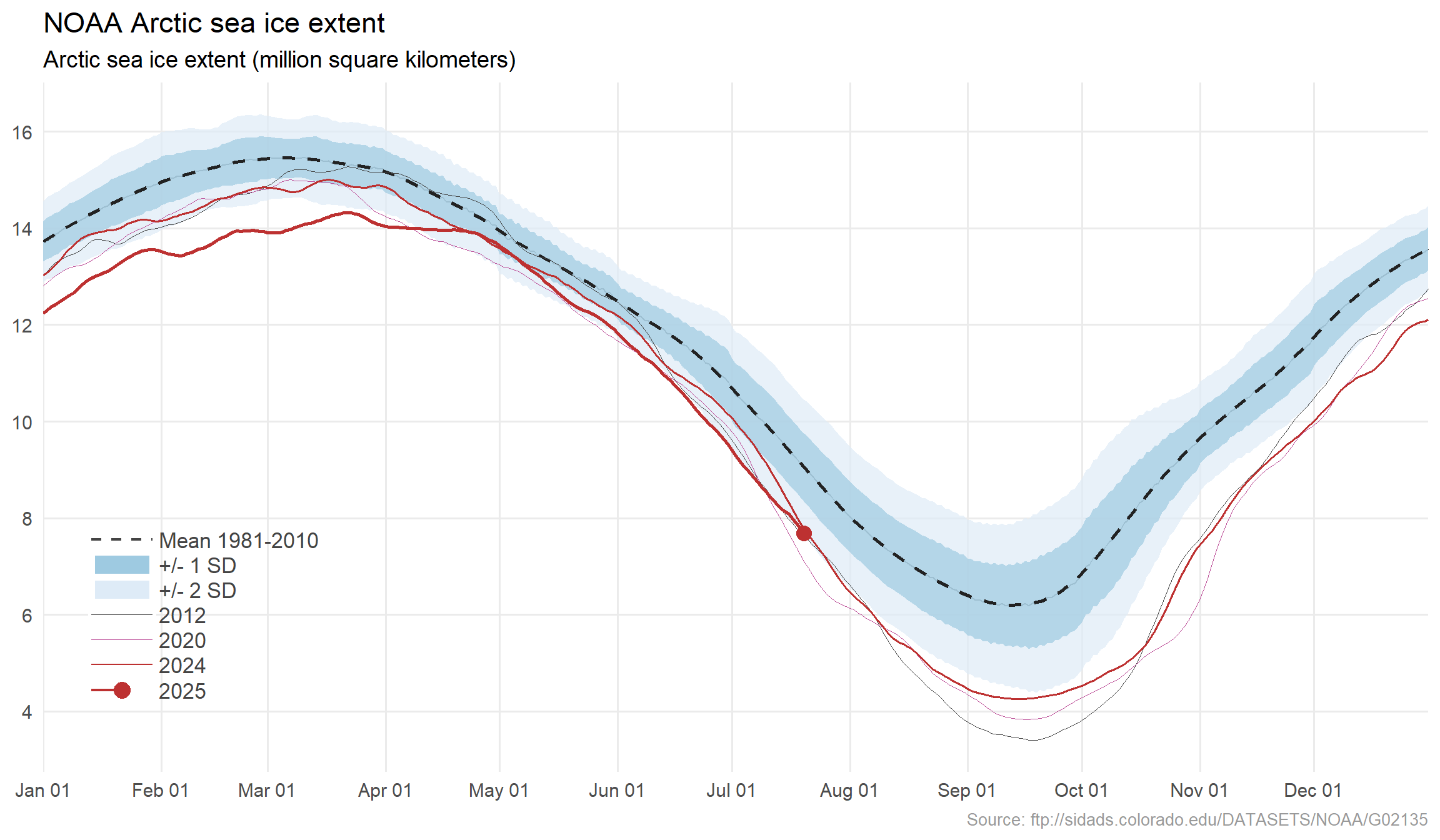
Arctic sea ice extent with standard deviations around the mean (1981-2010). The years 2012 and 2020 are added since these years had particularly low arctic sea ice extent as can be seen in the previous plot.
Decadal means
Show the code
decadal_means <-noaa_arctic %>%filter(yr >=1980) %>%mutate(decade =case_when( yr >=1980& yr <1990~"1980s", yr >=1990& yr <2000~"1990s", yr >=2000& yr <2010~"2000s", yr >=2010& yr <2020~"2010s", yr >=2020~"2020s" )) %>%group_by(decade, day) %>%summarise(roll =mean(roll)) %>%ggplot(aes(x = day, y = roll, color =as.factor(decade))) +# Individual yearsgeom_line(data = noaa_arctic,aes(x = day, y = roll, color = yr, group = yr),color ="gray", alpha =0.2 ) +# Averages (inherits aes from ggplot call)geom_smooth(aes(group = decade), se =FALSE, span =0.1) +theme(legend.position ="top",legend.text =element_text(size =18) ) +scale_color_manual(values =c(rev(brewer.pal(11, "RdYlBu"))[[3]],rev(brewer.pal(11, "RdYlBu"))[[5]],rev(brewer.pal(11, "RdYlBu"))[[7]],rev(brewer.pal(11, "RdYlBu"))[[9]],rev(brewer.pal(11, "RdYlBu"))[[11]] )) +scale_y_continuous(breaks =seq(4, 16, 2)) +theme_dark() +theme(legend.text =element_text(size =16),legend.key.height =unit(2, "mm") ) +scale_x_continuous(breaks =c(1, 32, 60, 91, 121, 152, 182, 213, 244, 274, 305, 335), labels =c("Jan 01", "Feb 01", "Mar 01", "Apr 01", "May 01", "Jun 01", "Jul 01", "Aug 01", "Sep 01", "Oct 01", "Nov 01", "Dec 01"), expand =c(0, 0), limits =c(1, 365)) +labs(title ="NOAA Arctic sea ice extent, decadal means",y ="Sea ice extent, million square km",caption ="Source: ftp://sidads.colorado.edu/DATASETS/NOAA/G02135" ) +guides(color =guide_legend(label.position ="bottom", nrow =1 ))decadal_means
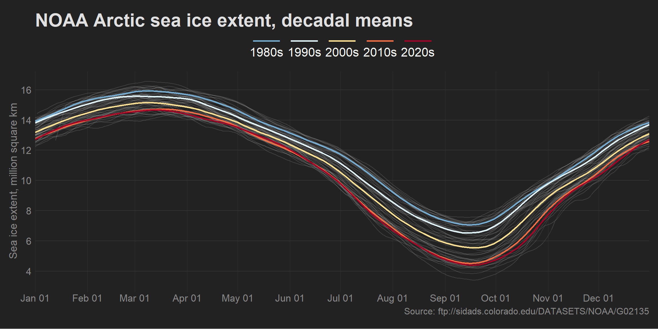
The gray, faint lines indicate the Arctic sea ice extent for each separate year (1978 - present), while the thick lines indicate decadal means.
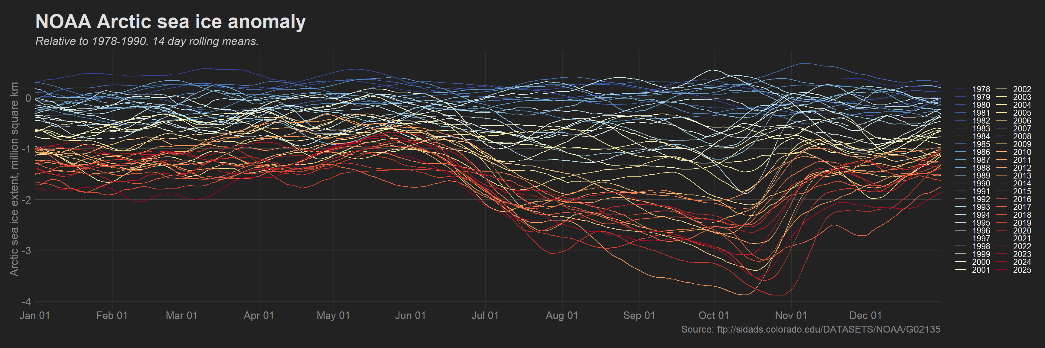
Sea ice extent anomaly
Show the code
# We define the baseline periodbaseline_start <-as.Date(min(noaa_arctic$date))baseline_end <-as.Date("1989-12-31")# Calculate the daily mean temperature for each day within the baseline periodbaseline_data <- noaa_arctic %>%filter(date >= baseline_start & date <= baseline_end) %>%group_by(day) %>%summarise(mean_extent =mean(Extent, na.rm =TRUE))# Left join the baseline dataice_anom <- noaa_arctic %>%left_join(baseline_data) %>%mutate(anomaly = Extent - mean_extent)library(zoo)zoo_data <-zoo(ice_anom$anomaly, order.by = ice_anom$date)moving_avg <-rollapply(zoo_data, width =14, FUN = mean, align ="right", fill =NA)ice_anom$roll <-as.vector(moving_avg[ice_anom$date])cols <-colorRampPalette(rev(brewer.pal(11, "RdYlBu")))(length(unique(ice_anom$yr)))sea_ice_anomaly <-ice_anom %>%mutate(yr =as.factor(yr)) %>%ggplot(aes(x = day, y = roll, color = yr)) +geom_line(aes(group = yr), size =0.45) +theme(legend.position ="right") +scale_color_manual(values = cols) +# scale_y_continuous(breaks = seq(4, 16, 2)) +theme_dark() +scale_x_continuous(breaks =c(1, 32, 60, 91, 121, 152, 182, 213, 244, 274, 305, 335), labels =c("Jan 01", "Feb 01", "Mar 01", "Apr 01", "May 01", "Jun 01", "Jul 01", "Aug 01", "Sep 01", "Oct 01", "Nov 01", "Dec 01"), expand =c(0, 0), limits =c(1, 365)) +labs(y ="Arctic sea ice extent, million square km",title ="NOAA Arctic sea ice anomaly",subtitle ="Relative to 1978-1990. 14 day rolling means.",caption ="Source: ftp://sidads.colorado.edu/DATASETS/NOAA/G02135" ) +guides(color =guide_legend(ncol =2)) +geom_point(data = ice_anom %>%filter(yr ==2024& day ==max(day)), aes(x = day, y = roll), size =3, color = cols[[length(unique(ice_anom$yr))]], fill ="#F9F9F9", shape =21)sea_ice_anomaly
Arctic sea ice extent 14-day rolling means of anomalies relative to a baseline period (1978 - 1990). The white dot indicates the last date in the dataset.
Interactive version
Show the code
library(ggiraph)ice_anom_p <- ice_anom %>%mutate(yr =as.factor(yr)) %>%ggplot(aes(x = day, y = roll, color = yr, tooltip = yr, data_id = yr)) +geom_line_interactive(aes(group = yr), size =0.6) +theme(legend.position ="right") +scale_color_manual(values = cols) +theme_dark() +theme(legend.position ="none",panel.background =element_rect(color ="#222222", fill ="#222222"),plot.background =element_rect(color ="#222222", fill ="#222222") ) +scale_x_continuous(breaks =c(1, 32, 60, 91, 121, 152, 182, 213, 244, 274, 305, 335), labels =c("Jan 01", "Feb 01", "Mar 01", "Apr 01", "May 01", "Jun 01", "Jul 01", "Aug 01", "Sep 01", "Oct 01", "Nov 01", "Dec 01"), expand =c(0, 0), limits =c(1, 365)) +labs(y ="",title ="NOAA Arctic sea ice",subtitle ="Arctic sea ice extent, million square km anomaly relative to 1978-1990.",caption ="Source: ftp://sidads.colorado.edu/DATASETS/NOAA/G02135" ) +geom_point(data = ice_anom %>%filter(yr ==2024& day ==max(day)), aes(x = day, y = roll), size =3, color = cols[[length(unique(ice_anom$yr))]], fill ="#F9F9F9", shape =21)# Create an interactive plot with just the yearsice_anom_yrs <- ice_anom %>%mutate(yr =as.factor(yr)) %>%group_by(yr) %>%slice(1) %>%ungroup() %>%mutate(group =rep(1:2, length.out =n()), # Assign columns alternatelyy =rep(1:ceiling(n() /2), each =2, length.out =n()) ) %>%ggplot(., aes(x = group, y =-y, tooltip ="", data_id = yr)) +geom_text_interactive(aes(label = yr), color ="#F9F9F9", family = font, size =2.8) +scale_x_continuous(breaks =1:2, labels =c("Column 1", "Column 2")) +theme_void() +scale_x_continuous(limits =c(0.5, 2.5)) +theme(panel.background =element_rect(color ="#222222", fill ="#222222"),plot.background =element_rect(color ="#222222", fill ="#222222") )# Define CSS theming# ---------------------------------------------------------------------------->tooltip_css <-" background-color: #F9F9F9; color: #FFFFFF; padding: 5px; border-radius: 2px; font-family: 'Arial', sans-serif; font-size: 13px;"# Patch the two plots togetherlibrary(patchwork)ice_anom_comp <- ice_anom_p + ice_anom_yrs +plot_layout(widths =c(8, 1), ncol =2)# Use ggiraph::girafe() to create the interactive plot and apply effects and CSS# theming# ---------------------------------------------------------------------------->ice_anom_int <-girafe(ggobj = ice_anom_comp,options =list(opts_hover(css ="stroke-width:6; cursor:pointer;") ),height_svg =6,width_svg =9)ice_anom_int
Arctic sea ice extent 14-day rolling means of anomalies relative to a baseline period (1978 - 1990). You can hover over the lines to see which year the line represents.
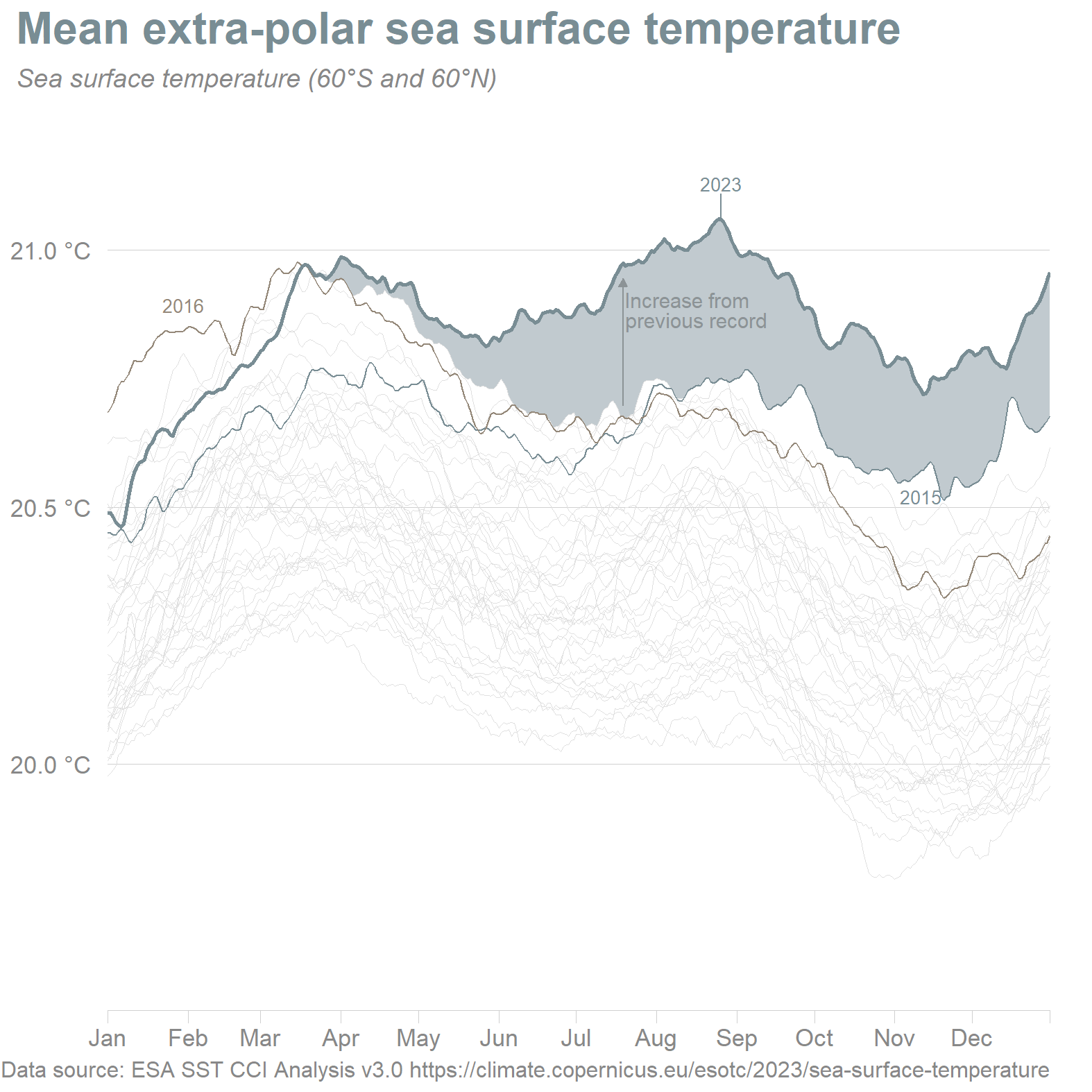
Sea surface temperature
Daily sea surface temperature averaged over the 60°S and 60°N domain Data source: ESA SST CCI Analysis v3.0 https://climate.copernicus.eu/esotc/2023/sea-surface-temperature
Show the code
esacci_v3 <-read_csv("temperature/copernicus/esacci_v3_sst_series_60S-60N_1980-2023.csv") %>%mutate(yr =year(date)) %>%# Create a 'day' variablegroup_by(yr) %>%mutate(day =as.numeric(date -floor_date(date, "year")) +1) %>%mutate(yr =as.factor(yr)) %>%mutate(emphasize =ifelse(yr %in%c(1980, 1990, 2000, 2010, 2020, 2021, 2022, 2015), 1, 0))# Create a new dataset for a ribbon to indicate the time period whereby 2023 is higher than any other yearesacci_v3_ribbon <-read_csv("temperature/copernicus/esacci_v3_sst_series_60S-60N_1980-2023.csv") %>%mutate(yr =year(date)) %>%# Create a 'day' variablegroup_by(yr) %>%mutate(day =as.numeric(date -floor_date(date, "year")) +1) %>%mutate(grouping =ifelse(yr ==2023, "y2023", "n2023")) %>%group_by(grouping, day) %>%mutate(max_sst =max(sst)) %>%distinct(grouping, .keep_all =TRUE) %>%select(day, grouping, max_sst) %>%pivot_wider(names_from = grouping, values_from = max_sst) %>%mutate(high_2023 =ifelse(y2023 > n2023, 1, 0)) %>%pivot_longer(cols =c(y2023, n2023))# With emphasis on later years# --------------------------->arrow <-arrow(type ="closed", length =unit(1.8, "mm"))# Create a data frame for arrowsarrows_df <- esacci_v3 %>%filter(yr %in%c(2015, 2016, 2023) & day %in%seq(160, 360, 10)) %>%mutate(yr =paste0("yr", yr)) %>%mutate(sst =ifelse(yr %in%c("yr2015", "yr2016"), sst +0.02, sst -0.03)) %>%rename(x = day) %>%mutate(xend = x) %>%select(-c(date, emphasize)) %>%pivot_wider(names_from = yr, values_from = sst) %>%mutate(y =case_when(yr2015 > yr2016 ~ yr2015, TRUE~ yr2016)) %>%rename(yend = yr2023) %>%# Changed this to only show one arrowfilter(x ==200)SST <-ggplot() +geom_ribbon(data = esacci_v3_ribbon %>%filter(high_2023 ==1) %>%group_by(day) %>%summarise(ymin =min(value),ymax =max(value) ),aes(x = day, ymin = ymin, ymax = ymax),fill ="#c1cacf", alpha =1 ) +geom_line(data = esacci_v3 %>%filter(yr %ni%c(2015, 2016, 2023)),aes(x = day, y = sst, group = yr, size =ifelse(yr %in%c(2015, 2016), 2, 1)), color ="#E0E0E0", size =0.2 ) +geom_line(data = esacci_v3 %>%filter(yr ==2015),aes(x = day, y = sst, group = yr), size =0.5, color ="#798d94" ) +geom_line(data = esacci_v3 %>%filter(yr ==2016),aes(x = day, y = sst, group = yr), size =0.5, color ="#948879" ) +geom_line(data = esacci_v3 %>%filter(yr ==2023),aes(x = day, y = sst, group = yr), size =1, color ="#798d94" ) +geom_text_repel(data = esacci_v3 %>%filter(yr ==2023& day ==max(day)),aes(x = day, y = sst, label = yr), size =5, color ="#798d94", nudge_x =12, family = font ) +# Text annotation for other yearsgeom_text_repel(data = esacci_v3 %>%filter(day ==max(day)),aes(x = day, y = sst, label =ifelse(emphasize ==1, as.character(yr), NA), color = yr),size =3.5, direction ="y", nudge_x =8, family = font, hjust =0 ) +# Text annotation for 2015 and 2016 and 2023 (all warm years)geom_text_repel(data = esacci_v3 %>%mutate(yr =year(date)) %>%filter(yr ==2016& day ==30),aes(x = day, y = sst, label = yr),color ="#948879", nudge_y =0.05, size =3.5, family = font ) +geom_text_repel(data = esacci_v3 %>%mutate(yr =year(date)) %>%filter(yr ==2015& day ==315),aes(x = day, y = sst, label = yr),color ="#798d94", nudge_y =-0.05, size =3.5, family = font ) +geom_text_repel(data = esacci_v3 %>%mutate(yr =year(date)) %>%filter(yr ==2023& day ==238),aes(x = day, y = sst, label = yr),color ="#798d94", nudge_y =0.07, size =3.5, family = font ) +theme_light() +theme(axis.line.x =element_line(color ="#d0d0d0", size =0.2),axis.ticks.x =element_line(color ="#d0d0d0", size =0.2),axis.ticks.length=unit(.25, "cm"),plot.title =element_text(margin =margin(l =-50, b =8), color ="#798d94"),plot.margin =unit(c(2, 8, 2, 2), "mm"),plot.subtitle =element_text(margin =margin(l =-50, b =8), color ="#888888"),panel.grid.major.x =element_blank(),axis.title.y =element_blank(),legend.position ="none" ) +labs(subtitle ="Sea surface temperature (60\u00B0S and 60\u00B0N)",y ="",title ="Mean extra-polar sea surface temperature",caption ="Data source: ESA SST CCI Analysis v3.0 https://climate.copernicus.eu/esotc/2023/sea-surface-temperature" ) +scale_y_continuous(breaks =c(20, 20.5, 21), labels =c("20.0 \u00B0C", "20.5 \u00B0C", "21.0 \u00B0C"),limits =c(19.6, 21.2) ) +scale_x_continuous(breaks =c(1, 32, 60, 91, 121, 152, 182, 213, 244, 274, 305, 335, 365), labels =c("Jan", "Feb", "Mar", "Apr", "May", "Jun", "Jul", "Aug", "Sep", "Oct", "Nov", "Dec", ""), expand =c(0, 0), limits =c(1, 365)) +scale_size(range =c(0.1, 0.5)) +geom_segment(data = arrows_df,aes(x = x, xend = xend, y = y, yend = yend),arrow = arrow, color ="#8c9396" ) +annotate(geom ="text", x =max(arrows_df$x)+1, y =20.92, family = font, color ="#8c9396", label ="Increase from\nprevious record", size =4, hjust =0, lineheight =0.8, vjust =1)SST
ESA SST CCI analysis v3.0 mean sea surface temperature averaged over the 60<U+00B0>S and 60<U+00B0>N domain (extrapolar ocean).
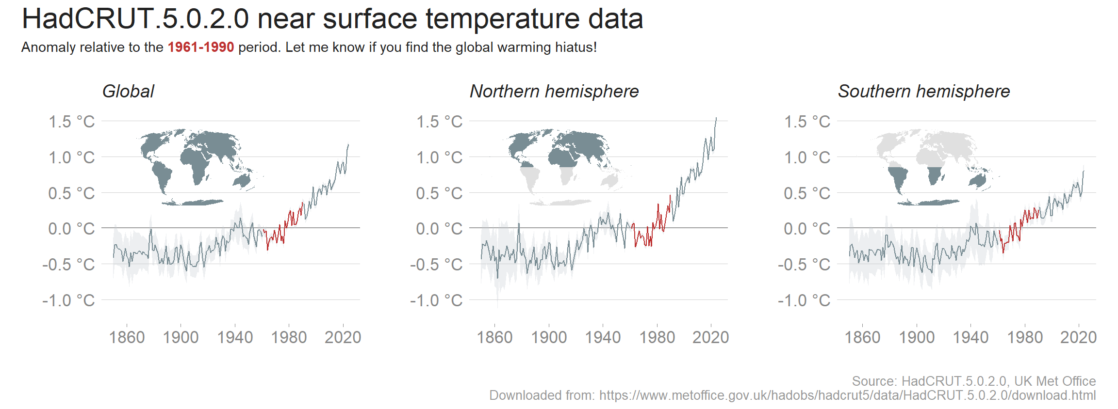
World temperatures since 1850
Show the code
# HadCRUT.5.0.2.0 analysis (from their website)# The principal HadCRUT5 data set is a statistical analysis that extends coverage in data sparse regions and an improved analysis in observed regions. A non-infilled version of the dataset is also available. HadCRUT5 analysis time series: ensemble means and uncertainties# The following files contain time series derived from the HadCRUT5 grids for selected regions. These 'best estimate' series are computed as the means of regional time series computed for each of the 200 ensemble member realisations. Time series are presented as temperature anomalies (deg C) relative to 1961-1990. Time series data are provided in CSV and NetCDF formats. The quoted uncertainties account for uncertainty described by the 200 ensemble members, together with an additional coverage uncertainty described in the HadCRUT5 paper that arises because the analysis is not globally complete. Details of uncertainty calculation can be found in the HadCRUT paper. Gridded data for the HadCRUT5 analysis ensemble members can be found later on this page.library(ggtext); library(tidyverse); library(maps); library(ggthemes)hadcrut5_northern <-read_csv("temperature/HadCRUT.5.0.2.0.analysis.summary_series.northern_hemisphere.monthly.csv")hadcrut5_southern <-read_csv("temperature/HadCRUT.5.0.2.0.analysis.summary_series.southern_hemisphere.monthly.csv")# The global dataset is the mean of northern and southernhadcrut5_global <-read_csv("temperature/HadCRUT.5.0.2.0.analysis.summary_series.global.monthly.csv")names(hadcrut5_global) <-c("yr_mo", "anomaly", "lower", "upper")names(hadcrut5_northern) <-c("yr_mo", "anomaly", "lower", "upper")names(hadcrut5_southern) <-c("yr_mo", "anomaly", "lower", "upper")# Global temperatures with uncertaintyhadcrut5 <- hadcrut5_northern %>%mutate(region ="Northern hemisphere") %>%bind_rows(hadcrut5_southern %>%mutate(region ="Southern hemisphere")) %>%bind_rows(hadcrut5_global %>%mutate(region ="Global")) %>%separate(col = yr_mo, into =c("yr", "mo"), sep ="-") %>%mutate(yr =as.numeric(yr)) %>%# Average by yeargroup_by(region, yr) %>%mutate(yr_anomaly_avg =mean(anomaly),lower_avg =mean(lower),upper_avg =mean(upper) ) %>%distinct(yr, .keep_all =TRUE)# For fun we generate some world maps to add to the plots as custom grobsnorthern <-map_data("world") %>%filter(!long >180& lat >0)southern <-map_data("world") %>%filter(!long >180& lat <0)global <-map_data("world") %>%filter(!long >180)northern <-global %>%ggplot(aes(map_id = region)) +geom_map(map = global, fill ="#E0E0E0")+geom_map(map = northern, fill ="#798d94")+expand_limits(x = global$long, y = global$lat) +coord_map("moll")+theme_void()+theme(plot.margin =unit(c(0,0,0,0), "mm"))southern <-global %>%ggplot(aes(map_id = region)) +geom_map(map = global, fill ="#E0E0E0")+geom_map(map = southern, fill ="#798d94")+expand_limits(x = global$long, y = global$lat) +coord_map("moll")+theme_void()+theme(plot.margin =unit(c(0,0,0,0), "mm"))global <-global %>%ggplot(aes(map_id = region)) +geom_map(map = global, fill ="#798d94")+expand_limits(x = global$long, y = global$lat) +coord_map("moll")+theme_void()+theme(plot.margin =unit(c(0,0,0,0), "mm"))# Globalglobal_temp <- hadcrut5 %>%filter(region =="Global") %>%ggplot(aes(x = yr, y = yr_anomaly_avg)) +geom_hline(yintercept =0, color ="#9F9F9F") +geom_ribbon(aes(x = yr, ymin = lower_avg, ymax = upper_avg), fill ="#c1cacf", alpha =0.3) +geom_line(data = hadcrut5 %>%filter(region =="Global") %>%filter(yr <1961),aes(x = yr, y = yr_anomaly_avg), color ="#798d94" ) +geom_line(data = hadcrut5 %>%filter(region =="Global") %>%filter(yr >=1961& yr <=1990),aes(x = yr, y = yr_anomaly_avg), color ="#bd3131" ) +geom_line(data = hadcrut5 %>%filter(region =="Global") %>%filter(yr >1990),aes(x = yr, y = yr_anomaly_avg), color ="#798d94" ) +labs(subtitle ="Global",y ="",x ="" ) +#<span style = 'color:#A63603'>theme_light() +theme(panel.grid.major.x =element_blank(),axis.ticks =element_blank(),panel.grid.minor =element_blank(),panel.border =element_blank(),axis.text =element_text(color ="#444444") ) +scale_x_continuous(breaks =c(1860, 1900, 1940, 1980, 2020)) +scale_y_continuous(limits =c(-1.2, 1.55), breaks =seq(-1, 1.5, 0.5), labels =c("-1.0 \u00B0C", "-0.5 \u00B0C", "0.0 \u00B0C", "0.5 \u00B0C", "1.0 \u00B0C", "1.5 \u00B0C"))+annotation_custom(grob =ggplotGrob(global), xmin =1830, xmax =1980, ymin =0.3, ymax =1.4)# Northern hemisphereno_hem_temp <- hadcrut5 %>%filter(region =="Northern hemisphere") %>%ggplot(aes(x = yr, y = yr_anomaly_avg)) +geom_hline(yintercept =0, color ="#9F9F9F") +geom_ribbon(aes(x = yr, ymin = lower_avg, ymax = upper_avg), fill ="#c1cacf", alpha =0.3) +geom_line(data = hadcrut5 %>%filter(region =="Northern hemisphere") %>%filter(yr <1961),aes(x = yr, y = yr_anomaly_avg), color ="#798d94" ) +geom_line(data = hadcrut5 %>%filter(region =="Northern hemisphere") %>%filter(yr >=1961& yr <=1990),aes(x = yr, y = yr_anomaly_avg), color ="#bd3131" ) +geom_line(data = hadcrut5 %>%filter(region =="Northern hemisphere") %>%filter(yr >1990),aes(x = yr, y = yr_anomaly_avg), color ="#798d94" ) +labs(subtitle ="Northern hemisphere",y ="",x ="" ) +#<span style = 'color:#A63603'>theme_light() +theme(panel.grid.major.x =element_blank(),axis.ticks =element_blank(),panel.grid.minor =element_blank(),panel.border =element_blank(),axis.text =element_text(color ="#444444") ) +scale_x_continuous(breaks =c(1860, 1900, 1940, 1980, 2020)) +scale_y_continuous(limits =c(-1.2, 1.55), breaks =seq(-1, 1.5, 0.5), labels =c("-1.0 \u00B0C", "-0.5 \u00B0C", "0.0 \u00B0C", "0.5 \u00B0C", "1.0 \u00B0C", "1.5 \u00B0C"))+annotation_custom(grob =ggplotGrob(northern), xmin =1830, xmax =1980, ymin =0.3, ymax =1.4)# Southern hemisphereso_hem_temp <- hadcrut5 %>%filter(region =="Southern hemisphere") %>%ggplot(aes(x = yr, y = yr_anomaly_avg)) +geom_hline(yintercept =0, color ="#9F9F9F") +geom_ribbon(aes(x = yr, ymin = lower_avg, ymax = upper_avg), fill ="#c1cacf", alpha =0.3) +geom_line(data = hadcrut5 %>%filter(region =="Southern hemisphere") %>%filter(yr <1961),aes(x = yr, y = yr_anomaly_avg), color ="#798d94" ) +geom_line(data = hadcrut5 %>%filter(region =="Southern hemisphere") %>%filter(yr >=1961& yr <=1990),aes(x = yr, y = yr_anomaly_avg), color ="#bd3131" ) +geom_line(data = hadcrut5 %>%filter(region =="Southern hemisphere") %>%filter(yr >1990),aes(x = yr, y = yr_anomaly_avg), color ="#798d94" ) +labs(subtitle ="Southern hemisphere", y ="",x ="" ) +#<span style = 'color:#A63603'>theme_light() +theme(panel.grid.major.x =element_blank(),axis.ticks =element_blank(),panel.grid.minor =element_blank(),panel.border =element_blank(),axis.text =element_text(color ="#444444") ) +scale_x_continuous(breaks =c(1860, 1900, 1940, 1980, 2020)) +scale_y_continuous(limits =c(-1.2, 1.55), breaks =seq(-1, 1.5, 0.5), labels =c("-1.0 \u00B0C", "-0.5 \u00B0C", "0.0 \u00B0C", "0.5 \u00B0C", "1.0 \u00B0C", "1.5 \u00B0C"))+annotation_custom(grob =ggplotGrob(southern), xmin =1830, xmax =1980, ymin =0.3, ymax =1.4)library(patchwork)p <- global_temp + no_hem_temp + so_hem_temp +plot_layout(nrow =1) +plot_annotation(title ="HadCRUT.5.0.2.0 near surface temperature data",subtitle ="Anomaly relative to the <span style = 'color:#bd3131'>**1961-1990**</span> period. Let me know if you find the global warming hiatus!",caption ="Source: HadCRUT.5.0.2.0, UK Met Office\nDownloaded from: https://www.metoffice.gov.uk/hadobs/hadcrut5/data/HadCRUT.5.0.2.0/download.html" ) &theme(plot.title =element_text(color ="#222222", size =22),plot.subtitle =element_markdown(color ="#222222"),plot.caption =element_text(color ="#999999", size =10, hjust =1) )p
HadCRUT.5.0.2.0 temperature data which extends coverage in sparse data regions (imputed). The data are the result of a ‘best estimate’ series computed as the means of regional time series for each of the 200 ensemble member relisations. The data are shown as anomalies in degrees Celcius relative to 1961 to 1990, stratified by the whole globe and Northern and Southern hemispheres. Remember, the Northern hemisphere has far more land mass than the Southern hemisphere. Land heats faster than water, and hence the larger increase in the Northern hemisphere.
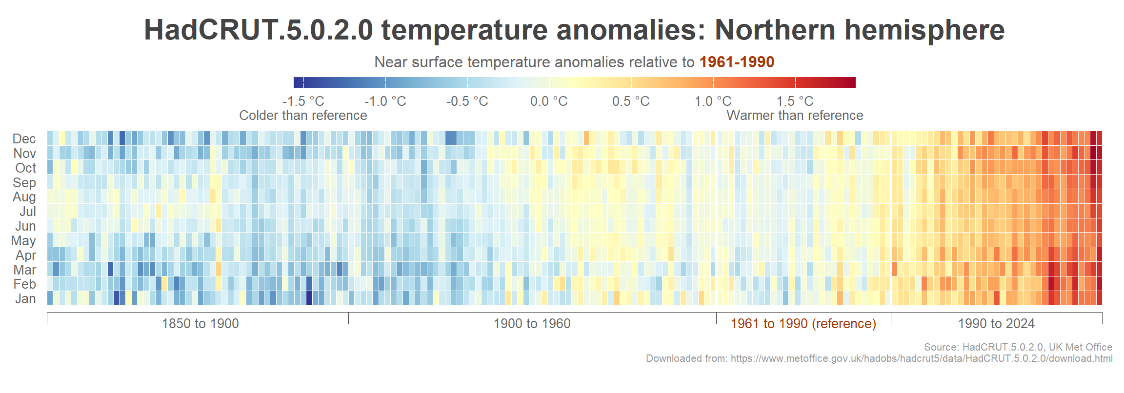
Northern hemisphere heatmap
Show the code
heatmap_northern <-hadcrut5_northern %>%separate(col = yr_mo, into =c("yr", "mo"), sep ="-") %>%mutate_at(vars(c(yr, mo)), as.integer) %>%mutate(mo =as.factor(mo)) %>%ggplot(aes(x = yr, y = mo, fill = anomaly)) +geom_tile(color ="white", size =0.1) +scale_fill_gradientn(colours =rev(brewer.pal(11, "RdYlBu")), breaks =seq(-1.5, 1.5, 0.5),labels =c("-1.5 \u00B0C\nColder than reference", "-1.0 \u00B0C", "-0.5 \u00B0C", "0.0 \u00B0C", "0.5 \u00B0C", "1.0 \u00B0C", "1.5 \u00B0C\nWarmer than reference") ) +theme_void() +labs(title ="HadCRUT.5.0.2.0 temperature anomalies: Northern hemisphere\n",caption ="\nSource: HadCRUT.5.0.2.0, UK Met Office\nDownloaded from: https://www.metoffice.gov.uk/hadobs/hadcrut5/data/HadCRUT.5.0.2.0/download.html" ) +theme(axis.text.y =element_text(family ="Roboto", size =10, color ="#666666", hjust =1),plot.title =element_text(family ="Roboto", size =22, color ="#444444", face ="bold", hjust =0.5, lineheight =0.3),plot.subtitle =element_text(family ="Roboto", size =14, lineheight =1.1, color ="#444444", face ="italic"),plot.caption =element_text(color ="#999999", size =8, family ="Roboto", hjust =1),legend.position ="top",legend.title =element_markdown(family ="Roboto", size =12, color ="#666666", hjust =0.5),legend.text =element_text(family ="Roboto", size =10, color ="#666666"),legend.key.width =unit(0.1, "npc"),legend.key.height =unit(3, "mm"),plot.margin =unit(c(3, 3, 8, 3), "mm") ) +scale_x_continuous(expand =c(0.01, 0.01)) +scale_y_discrete(labels =c("Jan", "Feb", "Mar", "Apr", "May", "Jun", "Jul", "Aug", "Sep", "Oct", "Nov", "Dec")) +guides(fill =guide_colorbar(title.position ="top",title ="Near surface temperature anomalies relative to <span style = 'color:#A63603'>**1961-1990**</span>" )) +# Indicate time periodscoord_cartesian(clip ="off") +geom_segment(aes(x =1849.5, xend =1899.5, y =0, yend =0), size =0.3, color ="#444444") +geom_segment(aes(x =1849.5, xend =1849.5, y =0, yend =-0.8), size =0.3, color ="#444444") +annotate(geom ="text", label ="1850 to 1900", family = font, color ="#666666", size =3.5, x =1875, y =-0.7, hjust =0.5) +geom_segment(aes(x =1899.5, xend =1960.5, y =0, yend =0), size =0.3, color ="#444444") +geom_segment(aes(x =1899.5, xend =1899.5, y =0, yend =-0.8), size =0.3, color ="#444444") +annotate(geom ="text", label ="1900 to 1960", family = font, color ="#666666", size =3.5, x =1930, y =-0.7, hjust =0.5) +geom_segment(aes(x =1960.5, xend =1989.5, y =0, yend =0), , size =0.3, color ="#444444") +geom_segment(aes(x =1960.5, xend =1960.5, y =0, yend =-0.8), size =0.3, color ="#444444") +# White vlinesgeom_segment(aes(x =1960.5, xend =1960.5, y =0.1, yend =12.5), color ="white", size =1) +geom_segment(aes(x =1989.5, xend =1989.5, y =0.1, yend =12.5), color ="white", size =1) +annotate(geom ="text", label ="1961 to 1990 (reference)", family = font, color ="#A63603", face ="bold", size =3.5, x =1975, y =-0.7, hjust =0.5) +geom_segment(aes(x =1989.5, xend =2024.5, y =0, yend =0), size =0.3, color ="#444444") +geom_segment(aes(x =1989.5, xend =1989.5, y =0, yend =-0.8), size =0.3, color ="#444444") +geom_segment(aes(x =2024.5, xend =2024.5, y =0, yend =-0.8), size =0.3, color ="#444444") +annotate(geom ="text", label ="1990 to 2024", family = font, color ="#666666", size =3.5, x =2007, y =-0.7, hjust =0.5)heatmap_northern
HadCRUT.5.0.2.0 temperature anomaly data for the Nortern hemisphere shown as a heatmap. The anomalies were calculated (in the raw dataset) relative to a reference period of 1961-1990.
General
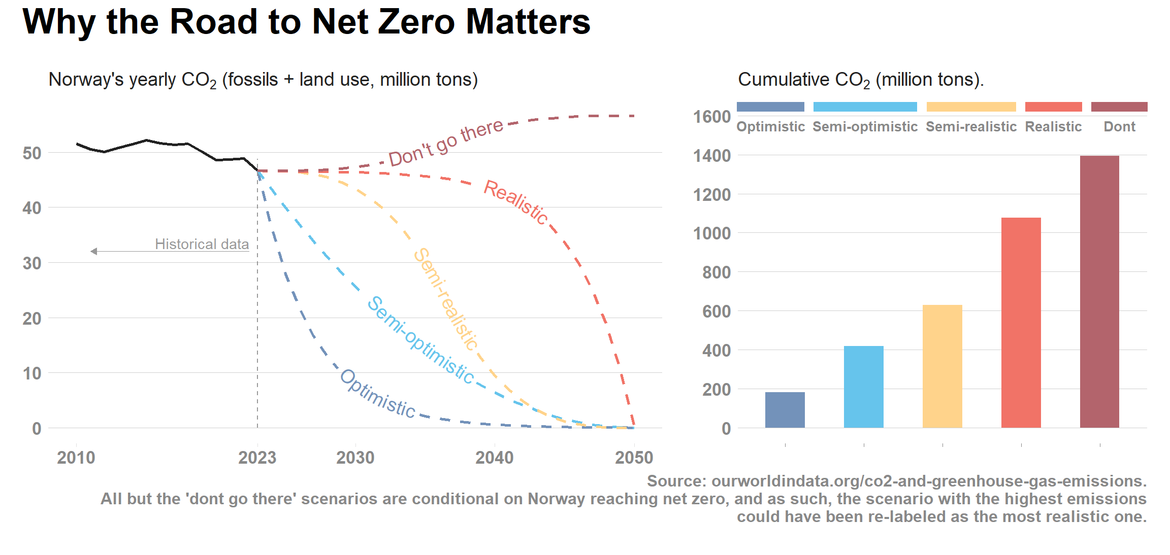
Why the road to net zero matters
The Norwegian politicians do like ‘net zero’ - the goal of becoming carbon neutral by year 2050. Simultaneously, however, their current policies do not show any signs of reducing CO2 emissions. How come? Well, the reason is that ‘net zero’ does not need to happen before 2050, and interim goal posts can be moved almost indefinitely (at least until 2050). Today’s politicians may not feel like they will be held accountable for their failure to reduce emissions today, and rather leave the responsibility to future governments. Besides, the goal of ‘net zero by 2050’ is just that, net zero by 2050, irrespective of the path leading to the goal.
The following plot illustrates why this is problematic: Since all CO2 produced will lead to global warming (either as atmospheric CO2 or stored in the world’s oceans), a slow reduction in CO2 towards net zero in 2050 will lead to more global warming than a swift cut in emissions.
(While net zero may be achieved due to a combination of emissions reduction and carbon capture/storage technology, the latter are likely to have at best a minor impact and I have therefore left them out of this analysis).
We update using 2023 data (46.6 million CO2 equivalents)
In 2023 (last year available in the data set) Norway emitted 46.6 Gt (million metric tons) of CO2. To reach net zero by 2050, there are several potential paths the country can pursue. We can model several hypothetical scenarios by fitting smoothed lines and visualize the net emissions under each of these scenarios (by integrating under the curves). All but the top (dark red line) are conditional on Norway actually reaching net zero by 2050, so one could argue that the dark red line should in fact be the one labeled “realistic”.
Show the code
# Generate the future scenarioslibrary(tweenr)library(geomtextpath)scenarios_df <-data.frame(x =seq(last_yr, 2050, 1),Optimistic =unlist(tween(c(em, 0), 2050- last_yr +1, ease ="exponential-out")),Semi_optimistic =unlist(tween(c(em, 0), 2050- last_yr +1, ease ="quadratic-out")),Semi_realistic =unlist(tween(c(em, 0), 2050- last_yr +1, ease ="cubic-in-out")),Realistic =unlist(tween(c(em, 0), 2050- last_yr +1, ease ="exponential-in")),Do_not =unlist(tween(c(em, em +10), 2050- last_yr +1, ease ="cubic-in-out")) )aucs_df <-tibble(scenario =names(scenarios_df)[-1],auc =as.numeric(NA))# Loop through each scenariofor (i in1:length(names(scenarios_df)[-1])) { scenario_name <-names(scenarios_df)[i +1]# Create the curve using approxfun curve <-approxfun(x = scenarios_df$x, y = scenarios_df[[scenario_name]])# Calculate the AUC using the integrate function auc <-integrate(curve, min(scenarios_df$x), max(scenarios_df$x))$value# Update the aucs_df tibble with the calculated AUC aucs_df$auc[i] <- auc}# Plot the curvesp_traj <-ggplot() +geom_line(data = co2_no,aes(x = yr, y = ann_em_mt), color ="#222222", size =1 ) +geom_textline(data = scenarios_df, aes(x = x, y = Optimistic, label ="Optimistic"), color ="#7392ba", linetype ="dashed", size =5, linewidth =1) +geom_textline(data = scenarios_df, aes(x = x, y = Semi_optimistic, label ="Semi-optimistic"), color ="#66c4ec", linetype ="dashed", size =5, linewidth =1) +geom_textline(data = scenarios_df, aes(x = x, y = Semi_realistic, label ="Semi-realistic"), color ="#ffd38b", linetype ="dashed", size =5, linewidth =1) +geom_textline(data = scenarios_df, aes(x = x, y = Realistic, label ="Realistic"), color ="#f17367", linetype ="dashed", size =5, linewidth =1) +geom_textline(data = scenarios_df, aes(x = x, y = Do_not, label ="Don't go there"), color ="#b3646c", linetype ="dashed", size =5, linewidth =1) +geom_segment(aes(x = last_yr, xend = last_yr, y =0, yend =48.8), linetype ="dashed", size =0.4, color ="#999999") +geom_segment(aes(x = last_yr -0.6, xend =2011, y =32, yend =32), linetype ="solid", size =0.25, color ="#999999", arrow = arrow) +annotate(geom ="text", family = font, color ="#999999", label ="Historical data", x = last_yr -0.6, y =32.5, hjust =1, vjust =0) +theme_light() +theme(panel.grid.major.x =element_blank(),axis.ticks.x =element_line(size =0.1, color ="#E0E0E0"),axis.title.y =element_blank() ) +scale_x_continuous(breaks =c(2010, last_yr, 2030, 2040, 2050)) +scale_y_continuous(breaks =seq(0, 50, 10), labels =c("0", "10", "20", "30", "40", "50")) +labs(subtitle =expression("Norway's yearly CO"[2] *" (fossils + land use, million tons)"))# Plot the AUCscum_co2 <- aucs_df %>%mutate(scenario =case_when( scenario =="Semi_optimistic"~"Semi-optimistic", scenario =="Semi_realistic"~"Semi-realistic", scenario =="Do_not"~"Dont",TRUE~ scenario )) %>%mutate(scenario =factor(scenario, levels =c("Optimistic", "Semi-optimistic", "Semi-realistic", "Realistic", "Dont"))) %>%ggplot(aes(x = scenario, y = auc, fill = scenario)) +geom_col(width =0.5) +scale_fill_manual(values =c("#7392ba", "#66c4ec", "#ffd38b", "#f17367", "#b3646c")) +theme_light() +theme(axis.text.x =element_blank(),legend.position =c(0.5, 0.95),legend.key.height =unit(3, "mm"),legend.key.width =unit(0.05, "npc"),axis.title.y =element_blank(),panel.grid.major.x =element_blank() ) +scale_y_continuous(limits =c(0, 1600), breaks =seq(0, 1600, 200)) +labs(subtitle =expression("Cumulative CO"[2] *" (million tons)."),caption ="Source: ourworldindata.org/co2-and-greenhouse-gas-emissions.\nAll but the 'dont go there' scenarios are conditional on Norway reaching net zero, and as such, the scenario with the highest emissions\ncould have been re-labeled as the most realistic one." ) +guides(fill =guide_legend(label.position ="bottom", nrow =1 ))library(patchwork)layout <-"AAABB"road_net_zero <-p_traj + cum_co2 +plot_layout(widths =c(3, 2), ncol =2) +plot_annotation(title ="Why the Road to Net Zero Matters") &theme(text =element_text(family = font, size =22, face ="bold"))road_net_zero
As we can see, while all scenarios end in net zero by 2050, the cumulative CO2 emissions vary considerably between them. The optimistic scenario is clearly the preferable one, but unfortunately extremely unlikely (at least in Norway). CO2 data are from OurWorldInData.
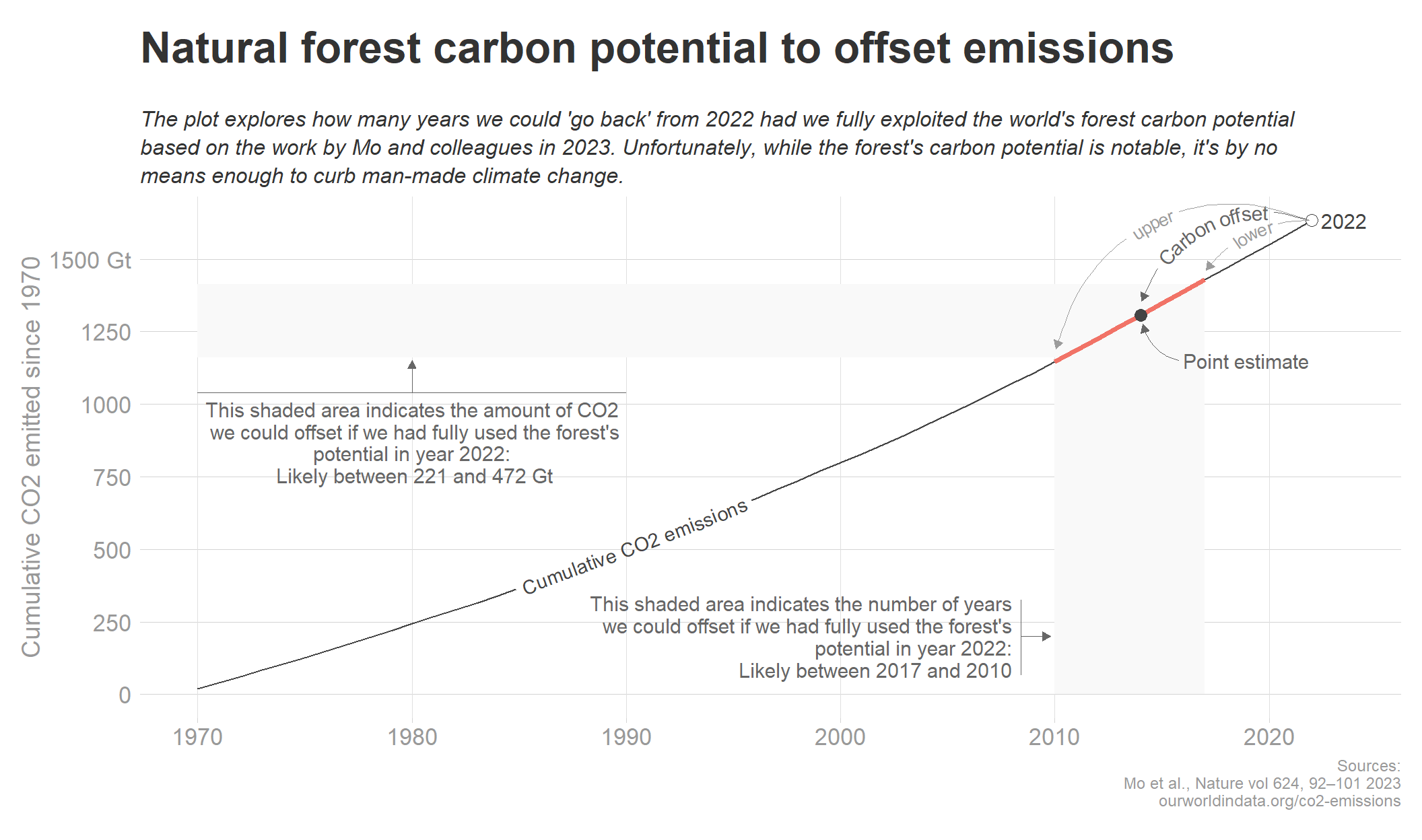
Forest’s potential to offset CO2 emissions
Both reforestation and preservation of existing forests can help sequester atmospheric CO2. During the April 2024 30 day chart challenge I explored the potential of the world’s forests to offset anthropogenic CO2 emissions using world emission data from OurWorldInData and model estimates from a paper in Nature from last year.
There is a lot of uncertainty to the estimates from the Nature study, and other studies may have gotten different estimates. Still, I think it’s worthwhile to show just how big or how small potential the forests have to offset CO2 emissions. Some are likely to overestimate the potential, which may mislead them into thinking that planting trees indefinitely will save us. Others may underestimate the potential, leading to unnecessary inaction.
I therefore revisit those data and display the potential in what I hope is a more understandable Some of the code got lost so the code is not complete unfortunately.
Show the code
# Load annual CO2 emissions data (https://ourworldindata.org/co2-emissions, fossil fuels and land use change)ann_co2 <-read_csv("general/ann_co2.csv") %>%filter(country =="World") %>%# Convert to billion tonsmutate(ann_em_Gt = ann_em /10^9)# We calculate cumulative CO2 emissions from 1970ann_co2 <- ann_co2 %>%filter(yr >=1970) %>%mutate(cum_sum =cumsum(ann_em_Gt))# The cumulative CO2 emissions in 2022:cum_co2_2022 <- ann_co2 %>%filter(yr ==max(yr)) %>%pull(cum_sum)# Based on the Nature article, where they estimate a potential to capture 328 Gt (billion tons):forest_est <-328# There is some model uncertainty around this estimate:lower_est <-221upper_est <-472# We calculate the various CO2 levels we can "return to" from 2022cum_co2_est <- cum_co2_2022 - forest_estcum_co2_lower <- cum_co2_2022 - lower_estcum_co2_upper <- cum_co2_2022 - upper_est# We use the pracma package to interpolate (to find the years we can "return" to if we were to restore the forest potential, with uncertainty)library(pracma)interpol_vals <- pracma::interp1(ann_co2$cum_sum, ann_co2$yr, c(cum_co2_lower, cum_co2_est, cum_co2_upper))# These are the estimated time points we can go "back" in time should we use all the forest potential# We round them to the nearest yearupper <-round(interpol_vals[[3]], 0)point_est <-round(interpol_vals[[2]], 0)lower <-round(interpol_vals[[1]], 0)# We now create segments in the data based on these pointsp <-ggplot() +geom_rect(aes(xmin =1970, xmax = lower, ymin = cum_co2_lower, ymax = cum_co2_upper), fill ="#F9F9F9") +geom_ribbon(data = ann_co2 %>%filter(yr >= upper & yr <= lower),aes(x = yr, ymin =0, ymax = cum_sum), fill ="#F9F9F9" ) +geom_textline(data = ann_co2 %>%filter(yr <= upper), aes(x = yr, y = cum_sum, label ="Cumulative CO2 emissions"), color ="#444444", linewidth =0.5, linetype ="dashed") +geom_line(data = ann_co2 %>%filter(yr >= upper & yr <= lower), aes(x = yr, y = cum_sum), color ="#f17367", size =1, linetype ="solid") +geom_line(data = ann_co2 %>%filter(yr >= lower), aes(x = yr, y = cum_sum), color ="#444444", linewidth =0.5, linetype ="dashed") +# Indicate point estimategeom_point(data = ann_co2 %>%filter(yr == point_est), aes(x = yr, y = cum_sum), shape =16, color ="#444444", size =3) +# Indicate the last data point (year 2022)geom_point(data = ann_co2 %>%filter(yr ==max(yr)), aes(x = yr, y = cum_sum), shape =21, fill ="white", color ="#444444", size =3) +labs(title ="Natural forest carbon potential to offset emissions",subtitle ="\nThe plot explores how many years we could 'go back' from 2022 had we fully exploited the world's forest carbon potential based on an article\npublished in Nature (Mo et al., 2023).",y ="Cumulative CO2 emitted since 1970",caption ="Sources:\nMo et al., Nature vol 624, 92<U+2013>101 2023\nourworldindata.org/co2-emissions" ) +# Text annotation (years)annotate(geom ="text", label =paste0("This shaded area indicates the number of years\nwe could offset if we had fully used the forest's\npotential in year 2022:\n Likely between ", lower, " and ", upper ),family = font, size =4, color ="#666666", x =2008, y =300, hjust =1, lineheight =0.9, vjust =0.5 ) +geom_segment(aes(x =2008.4, xend =2008.4, y =175, yend =420), size =0.2, color ="#666666") +geom_segment(aes(x =2008.4, xend =2009.8, y =300, yend =300), size =0.2, color ="#666666", arrow = arrow) +# Text annotation (emissions)annotate(geom ="text", label =paste0("This shaded area indicates the amount of CO2\n we could offset if we had fully used the forest's\npotential in year 2022:\n Likely between ", lower_est, " and ", upper_est, " Gt" ),family = font, size =4, color ="#666666", x =1980, y =1010, hjust =0.5, lineheight =0.9, vjust =1 ) +geom_segment(aes(x =1971.5, xend =1988.5, y =1040, yend =1040), size =0.2, color ="#666666") +geom_segment(aes(x =1980, xend =1980, y =1040, yend =1150), size =0.2, color ="#666666", arrow = arrow) +annotate(geom ="text", label =paste0("Point estimate"), family = font, size =4, color ="#666666", x =2016, hjust =0, y =1150, vjust =0.5) +geom_curve(aes(x =2015.8, xend = point_est +0.1, y =1150, yend = cum_co2_est -30), size =0.2, color ="#666666", arrow = arrow, curvature =-0.3) +# Curve from 2022geom_textcurve(aes(x =2021.9, xend = point_est +0.05, y = ann_co2 %>%filter(yr ==max(yr)) %>%pull(cum_sum), yend = cum_co2_est +50, label ="Carbon offset"), curvature =0.45, color ="#666666", linewidth =0.2, size =3.5, arrow = arrow) +theme_light() +theme(plot.subtitle =element_text(size =12))
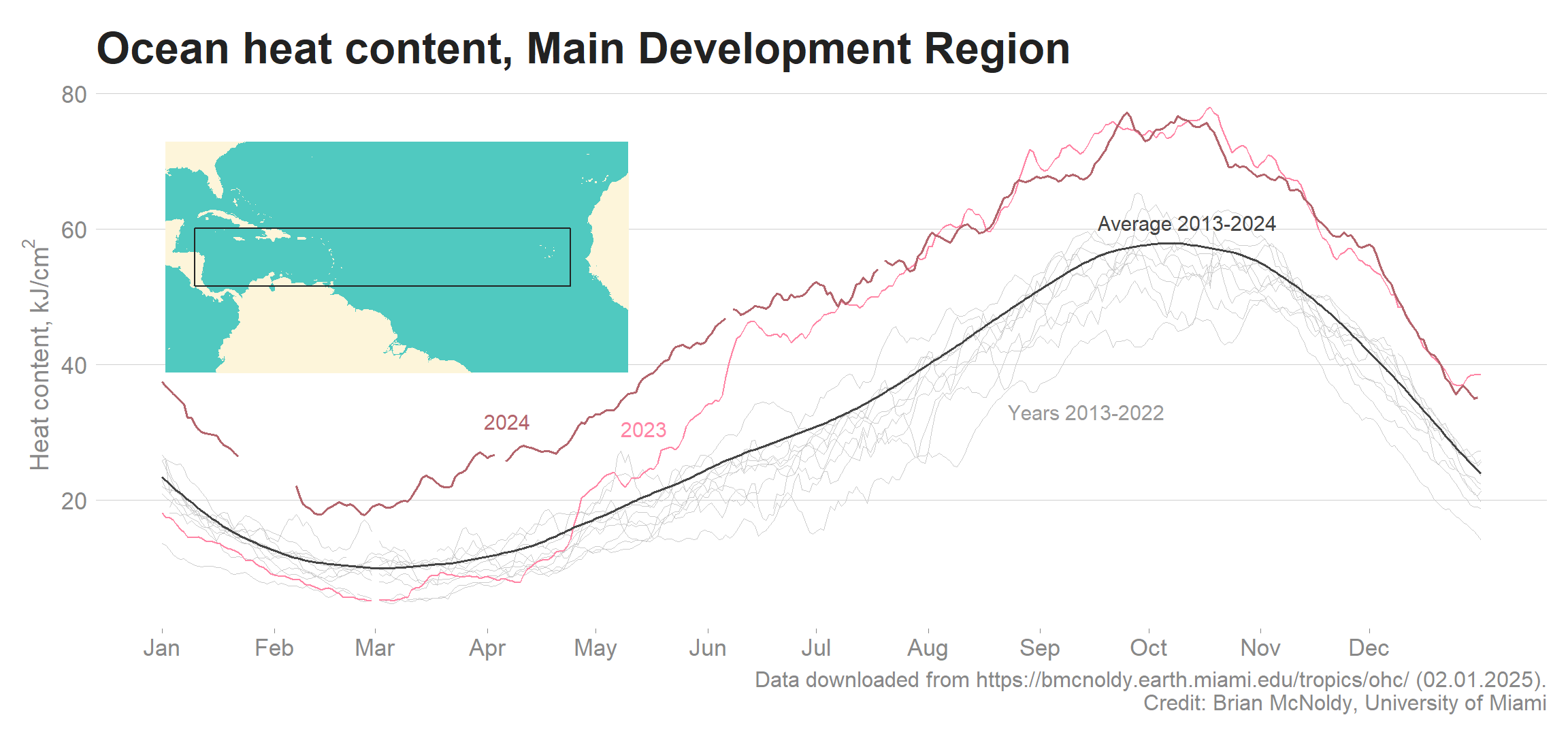
Ocean heat content in the Main Development Region
Show the code
library(sf)# Create the rectangle for the development region (10<U+00B0>N to 20<U+00B0>N, 85<U+00B0>W to 20<U+00B0>W)lat_min <-10lat_max <-20lon_min <--85lon_max <--20rectangle <-st_sfc(st_polygon(list(matrix(c( lon_min, lat_min, lon_max, lat_min, lon_max, lat_max, lon_min, lat_max, lon_min, lat_min ),ncol =2, byrow =TRUE ))))# Load world map datamap_region <-map_data("world")mdr_plot <-ggplot() +geom_polygon(data = map_region, aes(x = long, y = lat, group = group), fill ="#FDF5DA", color =NA) +# Add the main development region as a black rectanglegeom_sf(data = rectangle, fill =NA, color ="#222222", linewidth =0.5) +# Set the zoom areacoord_sf(xlim =c(-90, -10), ylim =c(-5, 35), expand =FALSE) +theme_void() +theme(panel.background =element_rect(color =NA, fill ="#50C9C0"))mdr_plot_grob <-ggplotGrob(mdr_plot)# Data downloaded from https://bmcnoldy.earth.miami.edu/tropics/ohc/ (02.01.2025)# All credit to Brian McNoldyohc_mdr <-read_csv("temperature/ohc_mdr.csv") %>%tibble() %>%mutate_all(~ifelse(is.nan(.), NA, .)) %>%mutate(day =c(1:366)) %>%pivot_longer(cols =-c(MMDD, CLIMO, day), names_to ="yr") %>%filter(yr !=2025)library(geomtextpath)# Pivot longerohc_mdr_plot <-ggplot() +# Lines for years 2013-2022geom_line(data = ohc_mdr %>%filter(yr <=2022), aes(x = day, y = value, group = yr),color ="#CCCCCC", size =0.1 ) +annotate(geom ="text", color ="#999999", label ="Years 2013-2022", size =4, hjust =0, family = font,y =33,x =235 ) +# Line for year 2023geom_line(data = ohc_mdr %>%filter(yr ==2023), aes(x = day, y = value, group =1),color ="#ff85a5", size =0.45 ) +annotate(geom ="text", color ="#ff85a5", label ="2023", size =4, hjust =0, family = font,y = ohc_mdr %>%filter(yr ==2023) %>%filter(day ==140) %>%pull(value) +3,x =128 ) +# Line for year 2024geom_line(data = ohc_mdr %>%filter(yr ==2024), aes(x = day, y = value, group = yr),color ="#b3646c", size =0.55 ) +annotate(geom ="text", color ="#b3646c", label ="2024", size =4, hjust =0, family = font,y = ohc_mdr %>%filter(yr ==2024) %>%filter(day ==90) %>%pull(value) +5,x =90 ) +# Mean 2013-2024geom_line(data = ohc_mdr %>%filter(yr ==2024), aes(x = day, y = CLIMO, group = yr),color ="#444444", size =0.6 ) +annotate(geom ="text", color ="#444444", label ="Average 2013-2024", size =4, hjust =0, family = font,y = ohc_mdr %>%filter(yr ==2024) %>%filter(day ==260) %>%pull(CLIMO) +5,x =260 ) +theme_light() +theme(panel.grid.major.x =element_blank() ) +labs(title ="Ocean heat content, Main Development Region",y =expression("Heat content, kJ/cm"^2),caption ="Data downloaded from https://bmcnoldy.earth.miami.edu/tropics/ohc/ (02.01.2025).\nCredit: Brian McNoldy, University of Miami" ) +scale_x_continuous(breaks =c(1, 32, 60, 91, 121, 152, 182, 213, 244, 274, 305, 335), labels =c("Jan", "Feb", "Mar", "Apr", "May", "Jun", "Jul", "Aug", "Sep", "Oct", "Nov", "Dec")) +# Add the main development regionannotation_custom(grob = mdr_plot_grob, xmin =2, xmax =130, ymin =30)ohc_mdr_plot
Ocean heat content in the Main Development Region
Works in progress
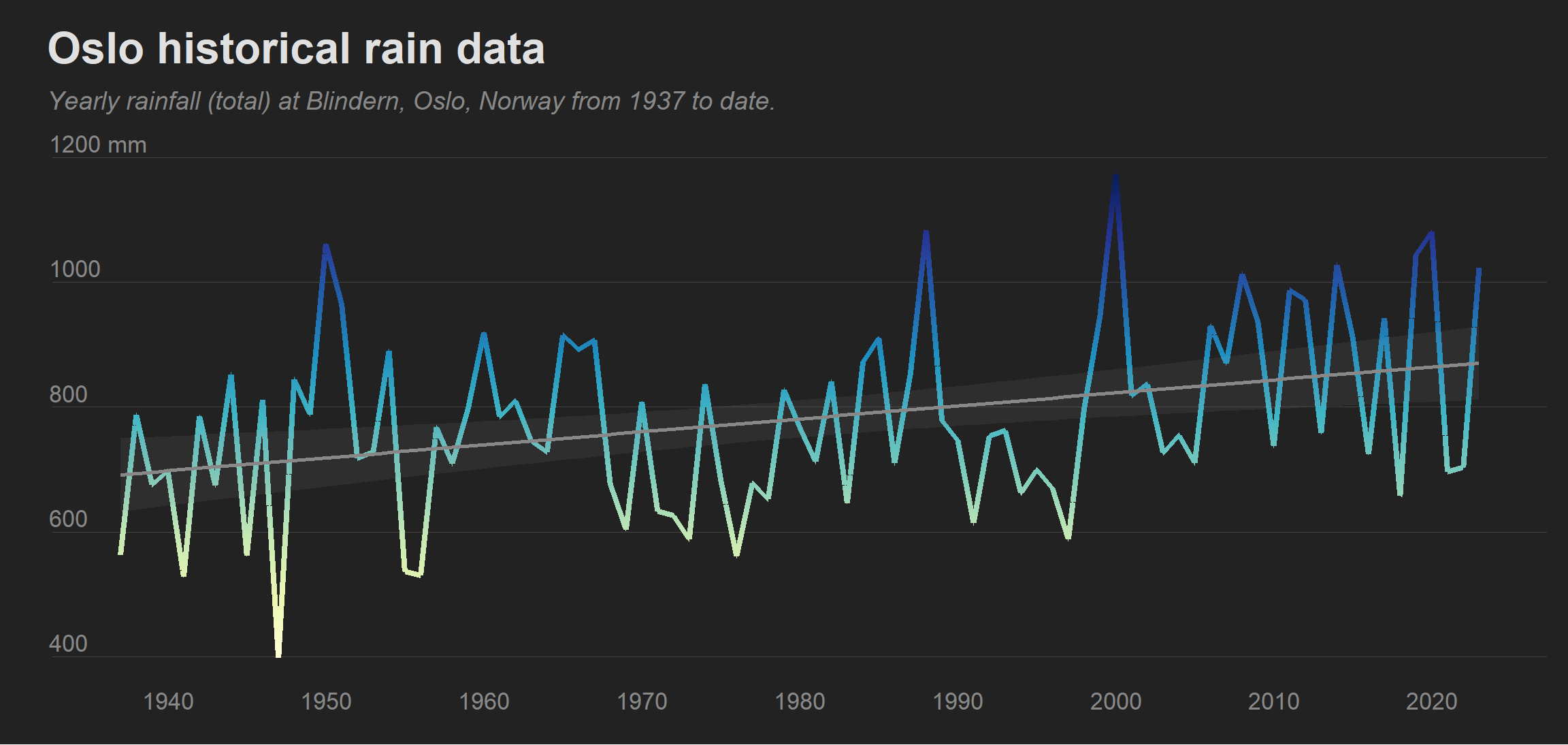
Oslo rain data
Show the code
comma_delim <-locale(decimal_mark =",")# Show as yearly sumoslo_rain <-read_delim("rain/blindern_rain_mm.txt", delim ="\t", locale = comma_delim) %>%mutate(date =dmy(date)) %>%mutate(yr =year(date)) %>%group_by(yr) %>%summarise(yearly_rain_total =sum(rain_mm, na.rm =TRUE)) %>%filter(yr !=2024)# We create linear interpolation between the years to enable us to apply a color# gradient to the geom_line()oslo_rain_interpolate <- oslo_rain %>%mutate(next_yr =lead(yr), next_rain =lead(yearly_rain_total)) %>%filter(!is.na(next_yr)) %>%rowwise() %>%do(data.frame(interpolated_yr =seq(.$yr, .$next_yr, length.out =10002)[-1], interpolated_rain =seq(.$yearly_rain_total, .$next_rain, length.out =10002)[-1] )) %>%ungroup()oslo_rain_p <-oslo_rain_interpolate %>%ggplot(aes(x = interpolated_yr, y = interpolated_rain, color = interpolated_rain)) +geom_line(size =1.5) +geom_smooth(data = oslo_rain, aes(x = yr, y = yearly_rain_total), method ="lm", se =TRUE, color ="#888888", alpha =0.1, linetype ="solid") +labs(title ="Oslo historical rain data",y ="",subtitle ="Yearly rainfall (total) at Blindern, Oslo, Norway from 1937 to date." ) +scale_y_continuous(labels =c("400", "600", "800", "1000", "1200 mm")) +scale_x_continuous(breaks =seq(1940, 2020, 10)) +theme_dark()+theme(legend.position ="none",axis.ticks.x =element_blank(),panel.grid.major.x =element_blank(),plot.subtitle =element_text(color ="#888888", margin =margin(b =20, l =-3)),plot.title =element_text(margin =margin(b =10, l =-3)),axis.text.y =element_text(margin =margin(r =-55), hjust =0, vjust =-0.3) )+scale_color_gradientn(colors =brewer.pal(9, "YlGnBu"))oslo_rain_p
This is a work in progress
Some Northern hemisphere analyses
Show the code
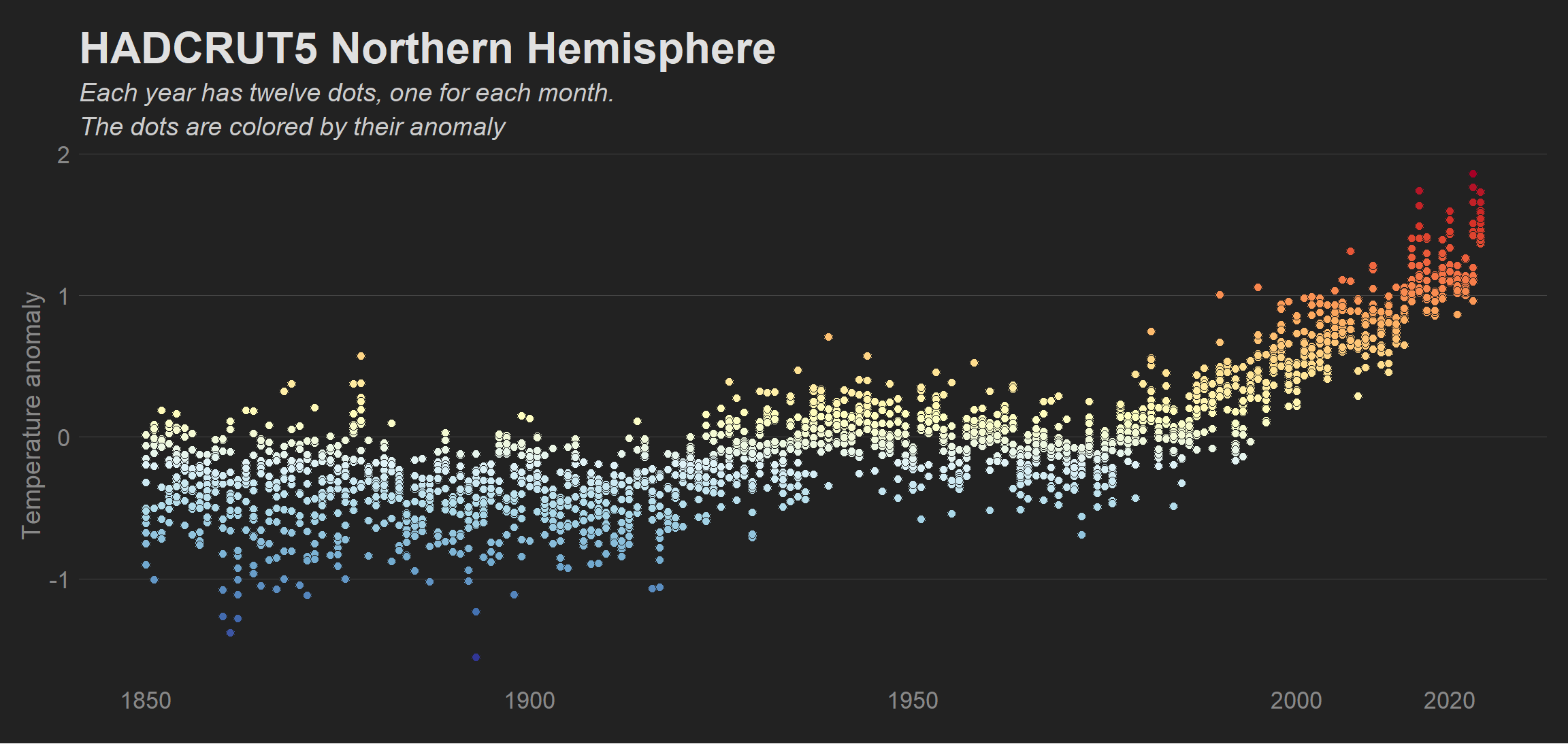
hadcrut5_northern <-read_csv("temperature/HadCRUT.5.0.2.0.analysis.summary_series.northern_hemisphere.monthly.csv")hadcrut5_northern <-hadcrut5_northern %>%separate(col = Time, into =c("yr", "mo"), sep ="-") %>%mutate(yr =as.numeric(yr),mo =as.numeric(mo) ) %>%rename(anom ="Anomaly (deg C)") %>%ggplot(aes(x = yr, y = anom, fill = anom)) +geom_point(shape =21, size =2, color ="#222222") +labs(title ="HADCRUT5 Northern Hemisphere",subtitle ="Each year has twelve dots, one for each month.\nThe dots are colored by their anomaly",y ="Temperature anomaly" ) +scale_fill_gradientn(colours =rev(brewer.pal(11, "RdYlBu")), breaks =seq(-1.5, 1.5, 0.5)) +theme_dark() +theme(legend.position ="none",panel.grid.major.x =element_blank(),axis.ticks.x =element_blank() ) +scale_x_continuous(breaks =c(1850, 1900, 1950, 2000, 2020))hadcrut5_northern
This is a work in progress
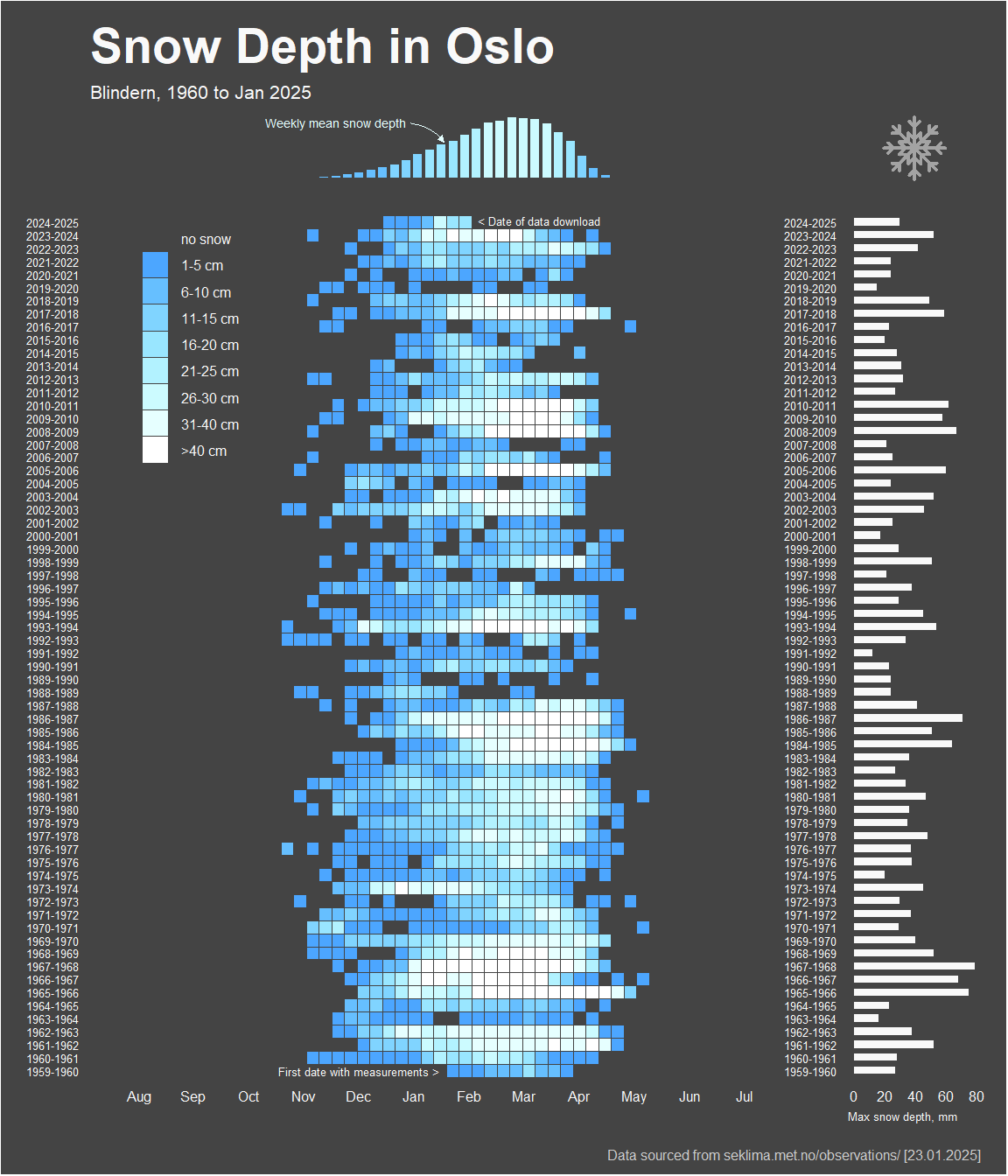
Snow depth Blindern, Oslo
Show the code
# Load required packages and specify a theme# ----------------------------------------------------------------------------->library(tidyverse);library(lubridate);library(ggpubr);library(showtext)arrow <-arrow(type ="closed", length =unit(1, "mm"))font <-"Asap"my_gg_theme <-function() {theme(# Control legend appearancelegend.position =c(0.15, 0.85),legend.key =element_rect(color ="#F9F9F9", size =0.1),legend.key.size =unit(3, "mm"),legend.background =element_blank(),legend.title =element_blank(),legend.text =element_text(family = font, size =6, color ="#F9F9F9"),# Title and subtitleplot.title =element_text(family = font, size =21, color ="#F9F9F9", face ="bold", lineheight =0.3),plot.subtitle =element_text(family = font, size =8, color ="#F9F9F9"),plot.caption =element_text(family = font, size =6, color ="#CCCCCC"),# Control text appearance and spacingaxis.title.x =element_blank(),axis.title.y =element_blank(),axis.text.y =element_text(size =5, color ="#F9F9F9", family = font, hjust =0),axis.text.x =element_text(size =6, color ="#F9F9F9", family = font, hjust =0.5),# Grid, ticks and plot linesaxis.line =element_blank(),axis.ticks.x =element_blank(),panel.grid.major.x =element_blank(),panel.grid.minor.x =element_blank(),axis.ticks.y =element_blank(),panel.grid.major.y =element_blank(),panel.grid.minor.y =element_blank(),panel.background =element_rect(fill ="#444444", color =NA),plot.background =element_rect(fill ="#444444", color =NA),plot.margin =unit(c(0,0,0,0), "mm") )}# Load the data# -----------------------------------------------------------------------------># The data was downloaded from seklima.met.no/observations [23.01.2025]snow_oslo <-read_delim("snow/oslo_snow.txt") %>%mutate(date =dmy(date))# Wrangle the data# -----------------------------------------------------------------------------># Some dates are missing, usually outside of the winter season. We can fill in these missing datesdate_range <-seq(min(snow_oslo$date, na.rm=TRUE), max(snow_oslo$date, na.rm=TRUE), by ="1 day")# Join with original data to fill in missing datessnow_oslo_wrangled <-tibble(date = date_range) %>%left_join(snow_oslo, by ="date") %>%mutate(year =year(date),day =yday(date) ) %>%# For simplicity we create "synthetic" week numbers going from 1 to 52 for each year, and cap each year to contain 364 daysfilter(day <=364) %>%select(date, year, day, snow_depth) %>%mutate(week =ceiling(day /7)) %>%select(-day) %>%# Now we calculate average for each week (by year) group_by(year, week) %>%mutate(avg_snow_depth =mean(snow_depth, na.rm =TRUE)) %>%# Slice to get one value per weekslice(which.min(date)) %>%ungroup() %>%# For missing values impute to 0 (missing values are anyways outside of the winter season)mutate(avg_snow_depth =ifelse(is.na(avg_snow_depth), 0, avg_snow_depth)) %>%# We now wish to organize the data so that each row in the tile plot contains two years, from week 27 one year to week 26 the next year# We add data for weeks 27 to 52 for 1959 (missing)bind_rows(tibble(year =c(rep(1959, 26)), week =c(27:52), avg_snow_depth =NA)) %>%arrange(year) %>%mutate(# Adjust year to reflect week 27 ("year 1") to week 26 ("year 2")years =ifelse(week >=27, paste(year, year +1, sep ="-"), # For weeks >= 27, the period is from year to next yearpaste(year -1, year, sep ="-")), # For weeks < 27, the period is from previous year to current year# We call it the Julian week, after the Julian calendarjulian_week =ifelse(week >=27, week -26, week +26) ) %>%select(-c(year, week)) %>%arrange(years, julian_week) %>%# Indicate snow depth categoriesmutate(snow_depth_cat =case_when( avg_snow_depth ==0~"no snow", avg_snow_depth >0& avg_snow_depth <=5~"1-5 cm", avg_snow_depth >5& avg_snow_depth <=10~"6-10 cm", avg_snow_depth >10& avg_snow_depth <=15~"11-15 cm", avg_snow_depth >15& avg_snow_depth <=20~"16-20 cm", avg_snow_depth >20& avg_snow_depth <=25~"21-25 cm", avg_snow_depth >25& avg_snow_depth <=30~"26-30 cm", avg_snow_depth >30& avg_snow_depth <=40~"31-40 cm", avg_snow_depth >40~">40 cm" ) ) %>%mutate(snow_depth_cat =factor(snow_depth_cat,levels =c("no snow", "1-5 cm", "6-10 cm", "11-15 cm", "16-20 cm", "21-25 cm", "26-30 cm", "31-40 cm", ">40 cm")))# Plotting# -----------------------------------------------------------------------------># Make a custom x-axis labeler (approximate!)# We see that the first week runs from january first until january 7th, whereby week 2 starts. With 52 weeks, we have approximately 52/12 = 4.33 weeks per monthwpm <-52/12x_labels <-c("Aug", "Sep", "Oct", "Nov", "Dec", "Jan", "Feb", "Mar", "Apr", "May", "Jun", "Jul")x_breaks <-c(wpm, wpm*2, wpm*3, wpm*4, wpm*5, wpm*6, wpm*7, wpm*8, wpm*9, wpm*10, wpm*11, wpm*12)# Generating the lower left (LL) panel (tile plot)# ----------------------------------------------->p_LL <- snow_oslo_wrangled %>%mutate(start =case_when(years =="1959-1960"& julian_week ==28~"First date with measurements >")) %>%mutate(stop =case_when(years =="2024-2025"& julian_week ==30~"< Date of data download")) %>%ggplot(aes(x = julian_week, y = years, fill = snow_depth_cat)) +geom_tile(color ="#444444", size =0.1) +scale_fill_manual(values =c("#444444", "#4ca6ff", "#66bfff", "#80d4ff", "#99e6ff", "#b2f2ff", "#ccfbff", "#e6ffff", "#FFFFFF"), na.value ="#444444", na.translate = F) +my_gg_theme() +coord_cartesian(clip ="off") +scale_x_continuous(breaks = x_breaks, labels = x_labels, expand =c(0, 0)) +geom_text(aes(label = start), hjust =1, color ="#F9F9F9", family = font, size =1.7, vjust =0.5) +geom_text(aes(label = stop), hjust =0, color ="#F9F9F9", family = font, size =1.7, position =position_nudge(x =1), vjust =0.3) +guides(fill =guide_legend(override.aes =list(size =4, linewidth =0)))# Generating the top left (TL) panel (visualizes which parts of the year have the most snow)# ----------------------------------------------->p_TL <- snow_oslo_wrangled %>%group_by(julian_week) %>%summarise(avg_week =mean(avg_snow_depth, na.rm =TRUE)) %>%mutate(snow_depth_cat =case_when( avg_week ==0~"no snow", avg_week >0& avg_week <=5~"1-5 cm", avg_week >5& avg_week <=10~"6-10 cm", avg_week >10& avg_week <=15~"11-15 cm", avg_week >15& avg_week <=20~"16-20 cm", avg_week >20& avg_week <=25~"21-25 cm", avg_week >25& avg_week <=30~"26-30 cm", avg_week >30& avg_week <=40~"31-40 cm", avg_week >40~">40 cm" )) %>%mutate(snow_depth_cat =factor(snow_depth_cat, levels =c("no snow", "1-5 cm", "6-10 cm", "11-15 cm", "16-20 cm", "21-25 cm", "26-30 cm", "31-40 cm", ">40 cm"))) %>%ggplot(aes(x = julian_week, y = avg_week, fill = snow_depth_cat)) +geom_col(width =0.75) +my_gg_theme() +theme(axis.text.y =element_blank(), axis.text.x =element_blank(), axis.title.x =element_blank(), legend.position ="none") +scale_fill_manual(values =c("#4ca6ff", "#66bfff", "#80d4ff", "#99e6ff", "#b2f2ff", "#ccfbff", "#e6ffff", "#FFFFFF")) +labs(title ="Snow Depth in Oslo",subtitle ="Blindern, 1960 to Jan 2025" ) +annotate(geom ="text", label ="Weekly mean snow depth", family = font, size =1.8, x =25, y =22, color ="#e6ffff", hjust =1) +geom_curve(aes(x =25.4, xend =28.2, y =21.8, yend =14.5), color ="#e6ffff", curvature =-0.2, arrow = arrow, size =0.1)# Now the lower right (LR) panel, showing max snow depth per winter season (bar plot)# ----------------------------------------------->p_LR <-tibble(date = date_range) %>%left_join(snow_oslo, by ="date") %>%mutate(year =year(date),day =yday(date) ) %>%# For simplicity we create "synthetic" week numbers going from 1 to 52 for each year, and cap each year to contain 364 daysfilter(day <=364) %>%select(date, year, day, snow_depth) %>%mutate(week =ceiling(day /7)) %>%select(-day) %>%# Create year-spans like before so we capture the snow during the full wintersmutate(# Adjust year to reflect week 27 ("year 1") to week 26 ("year 2")years =ifelse(week >=27,paste(year, year +1, sep ="-"), # For weeks >= 27, the period is from year to next yearpaste(year -1, year, sep ="-") ) # For weeks < 27, the period is from previous year to current year ) %>%# Calculate sum of snowgroup_by(years) %>%summarise(max_snow =max(snow_depth, na.rm =TRUE)) %>%ungroup() %>%ggplot(aes(x = max_snow, y = years)) +geom_col(fill ="#F9F9F9", width =0.55) +my_gg_theme() +theme(axis.title.x =element_text(size =5, color ="#F9F9F9", family = font, hjust =0)) +labs(x ="Max snow depth, mm")# And finally an plot spacer for top right (TR)# ----------------------------------------------->library(png)library(grid)snowflake <- png::readPNG("snow/snowflake.png")p_TR <-ggplot() +annotation_custom(rasterGrob(snowflake), xmin =-Inf, xmax =Inf, ymin =-Inf, ymax =Inf) +my_gg_theme()library(patchwork)comp <- p_TL + p_TR + p_LL + p_LR +plot_layout(ncol =2, nrow =2, heights =c(1, 13), widths =c(5, 1)) &theme(plot.margin =unit(c(.2, .2, .2, .2), "cm")) &plot_annotation(theme =theme(plot.background =element_rect(fill ="#444444")),caption ="Data sourced from seklima.met.no/observations/ [23.01.2025]" ) &theme(plot.caption =element_text(family = font, size =6, color ="#CCCCCC"))# We can look at change in snow depth over time (by calendar year) last 35 years,# filtering only months november to april# snow_lm_df <- # snow_oslo %>%# mutate(year = year(date), month = month(date), week = isoweek(date)) %>%# filter(year >= 1989 & year <= 2024) %>%# group_by(year) %>%# summarise(mean_snow_depth = mean(snow_depth, na.rm = TRUE))# # model <- lm(mean_snow_depth ~ year, data = snow_lm_df)# estimate_per_yr <- model$coefficients[[2]]# lower <- confint(model)[[2, 1]]# upper <- confint(model)[[2, 2]]# # paste0(estimate_per_yr, ", most likely between", lower, " and ", upper)# Display plotcomp